Feature redesign that led to significantly higher engagement
THE ROLE
Cleo
iOS & Android Apps
Involvement
UX / UI Design
iOS & Android Apps
Involvement
UX / UI Design
THE PROJECT
Cleo is a money management app that helps people with their finance health.
Based on AI, the app provides a clever chat experience. Cleo talks like a big sister that will call out the objectionable money behaviours without shaming users. This aims to remove the stress and guilt people can feel when they check their finances.
I joined as a contractor at Cleo for 6 months and mostly worked on the credit score feature redesign.
I worked in a squad (10 people in total) in an agile way.
I was the only designer of the squad and collaborated closely with a UX Researcher and a UX Writer.
I worked in a squad (10 people in total) in an agile way.
I was the only designer of the squad and collaborated closely with a UX Researcher and a UX Writer.
____________________________________
Context & Ideation
CREDIT SCORE AT CLEO
Cleo offers 2 subscriptions plans: Cleo Plus and Cleo Builder (the most comprehensive and expensive one).
Credit score is a number between 350 and 800 that represents people's financial health. Credit score has a huge impact in the US as it determines the interest fees people will pay when getting a loan and wether they will get a mortgage or not, amongst other things.
The app provides a credit score experience made of:
The app provides a credit score experience made of:
• Pre authorisation experience - Before users pull their score
• Authorisation flow - The flow to access user's score
• Post authorisation experience - Shows users score and what impacted it
• Authorisation flow - The flow to access user's score
• Post authorisation experience - Shows users score and what impacted it
Why did we start to care about the credit score feature?
Our squad (named "Shire" 🌳) was working on Conversion to Cleo Builder. At the beginning of the Quarter, we've been searching what could positively impact it and found out that credit score could be a factor.
Data showed a possible correlation between interaction with the credit score feature & conversion to Builder.
(see graph below👇)
(see graph below👇)
PROBLEM
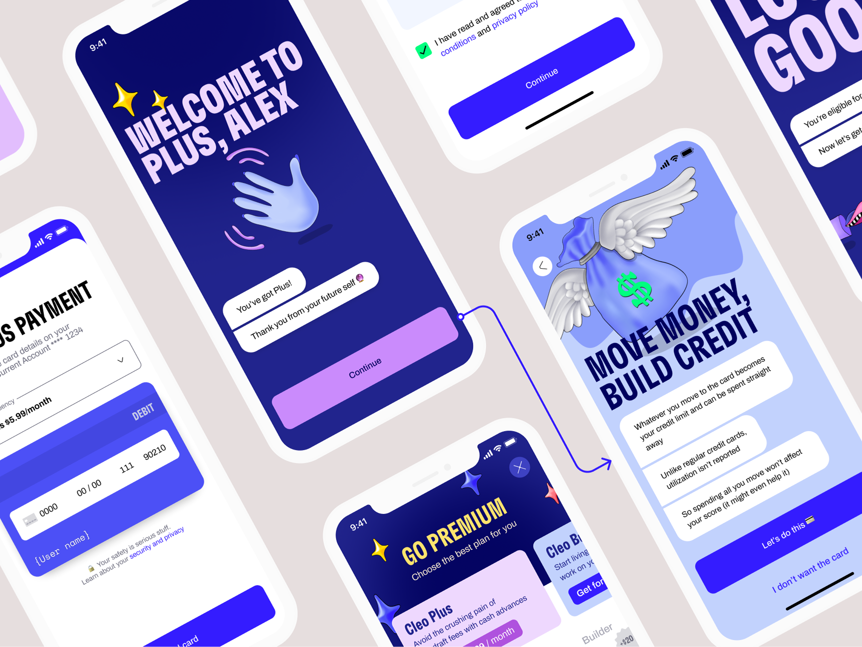
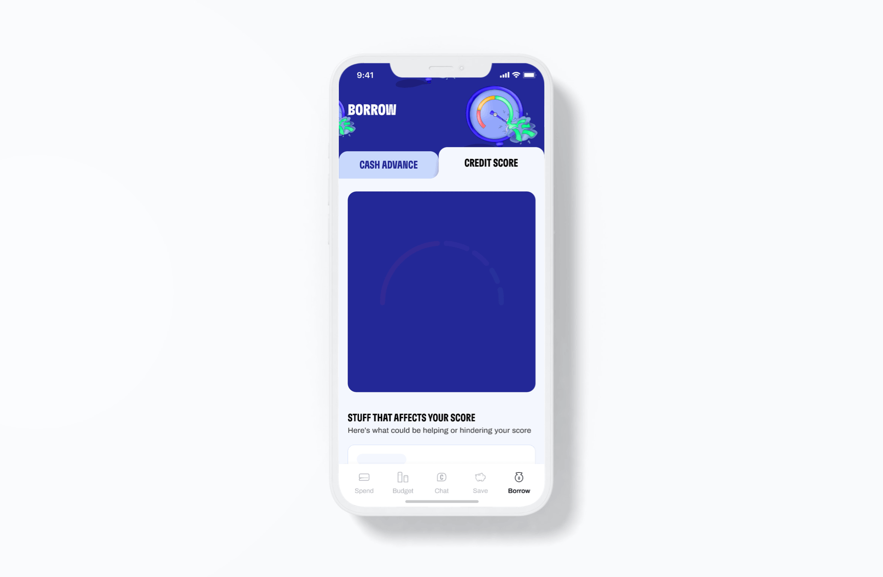
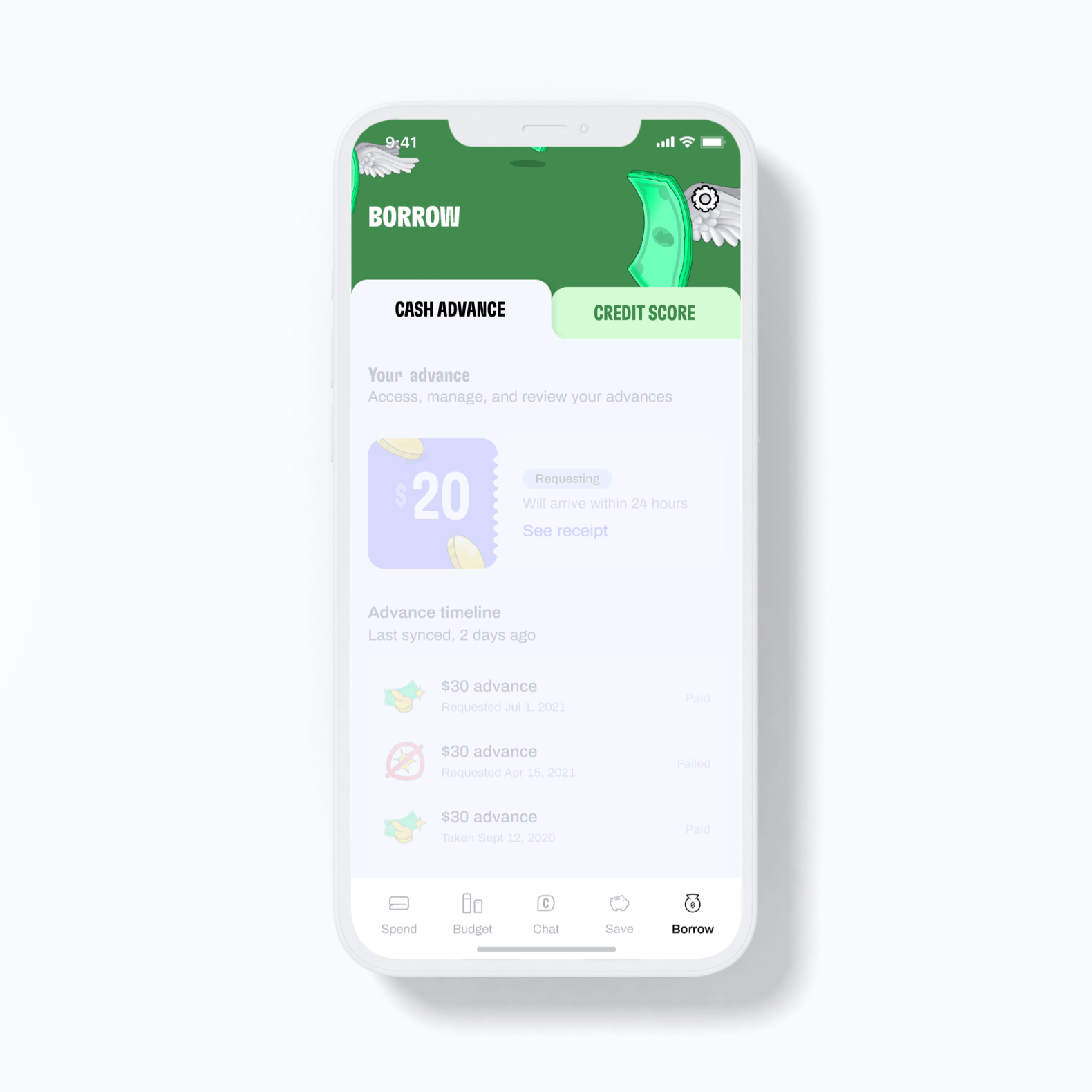
The Credit Score feature (see designs below 👇) wasn’t being used as much as expected.
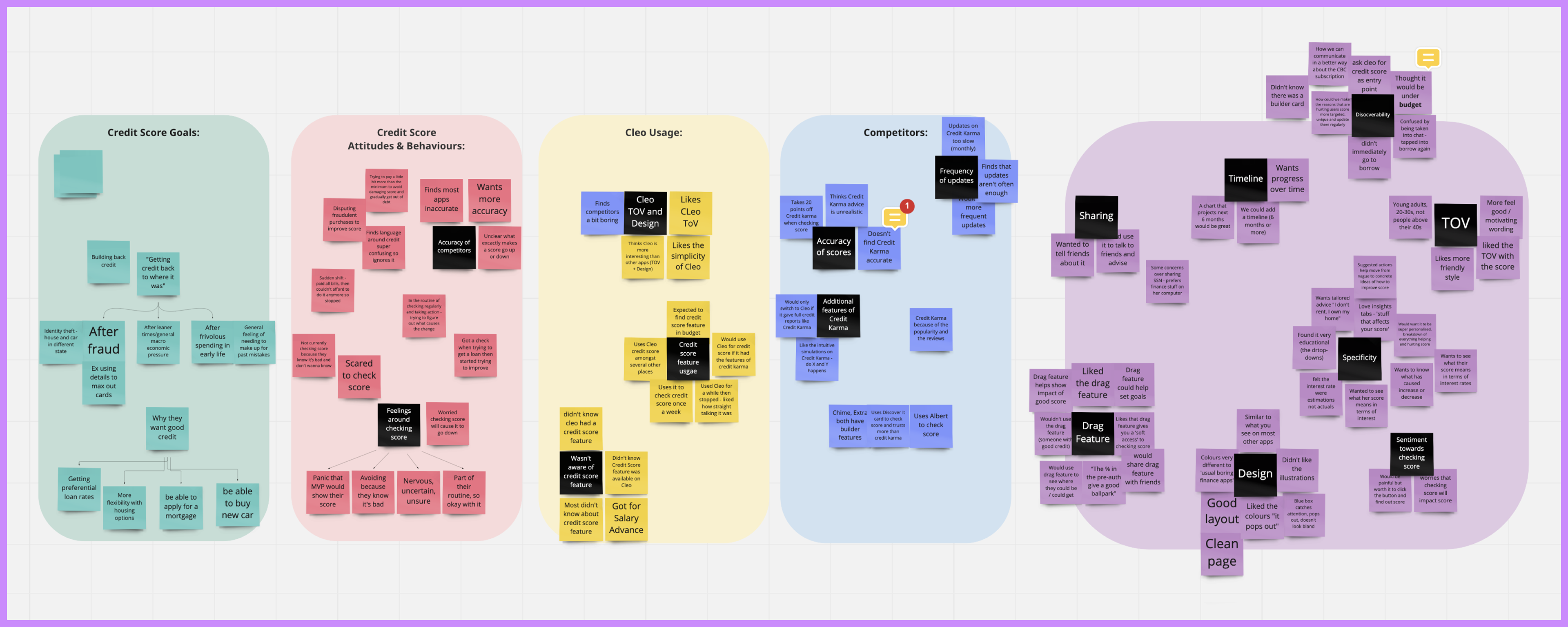
From existing research and user feedback, we learned that:
• The illustration style was unclear and confusing
• Users mainly looked at the score number itself. They were using the feature just to keep an eye out for any changes
• They would have loved to get personal insight as to why their score changed and how they can boost it
• The feature lacked visibility. It as buried inside a tab where it didn't really belong.
So even though the feature had strong potential value, users weren’t fully engaging with it.
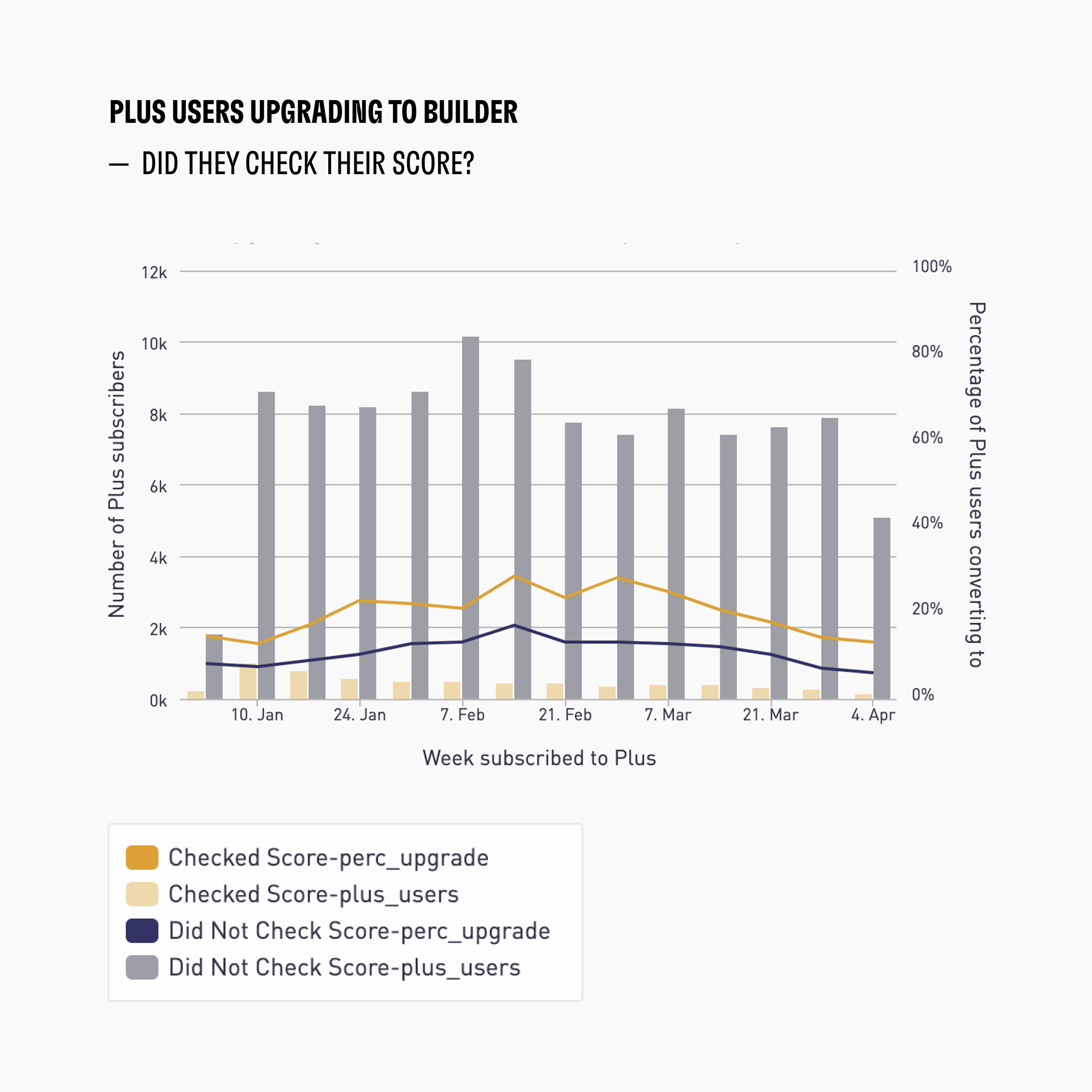
Data to support Correlation between Credit Score and Conversion to Builder
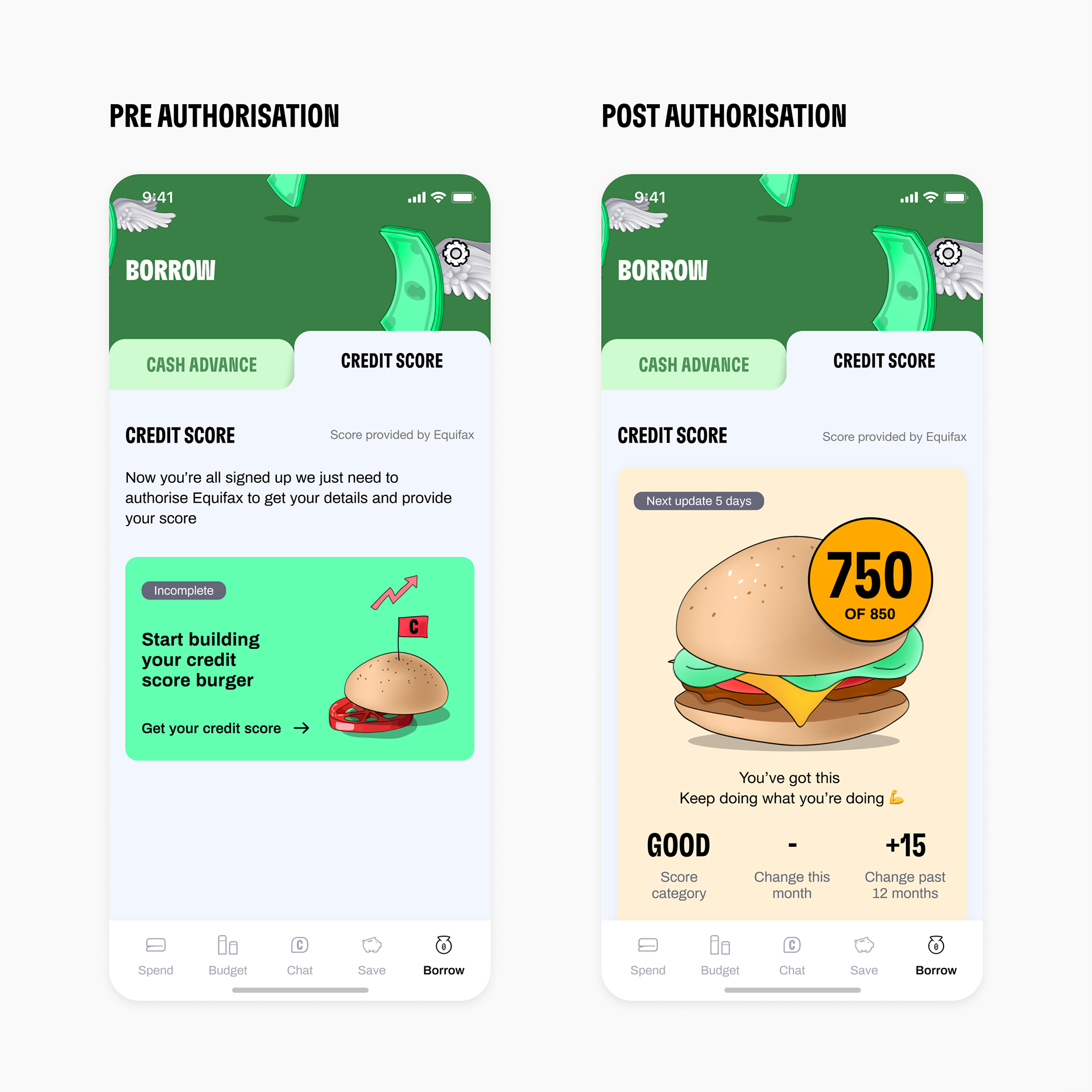
Previous Experience for Credit Score Pre & Post Authorisation
HYPOTHESIS & TARGET
Our hypothesis:
By improving the credit score feature and its discoverability we can impact conversion from
Cleo Plus to Cleo Builder.
Our target:
20% increase of Plus users that check their credit score within their first 7 days
20% increase of Plus users that check their credit score within their first 7 days
IDEATION WORKSHOP
To kick off the work I facilitated a workshop to identify the opportunities and ideate on initiatives to increase the number of users checking their score.
We discussed the full journey (Pre-authorisation / Authorisation Flow / Post-authorisation) and used the elements of feedback from previous user testing as a basis.

Ideation Workshop around Credit Score
I then started to ideate and sketched what the feature and the journey could look like.
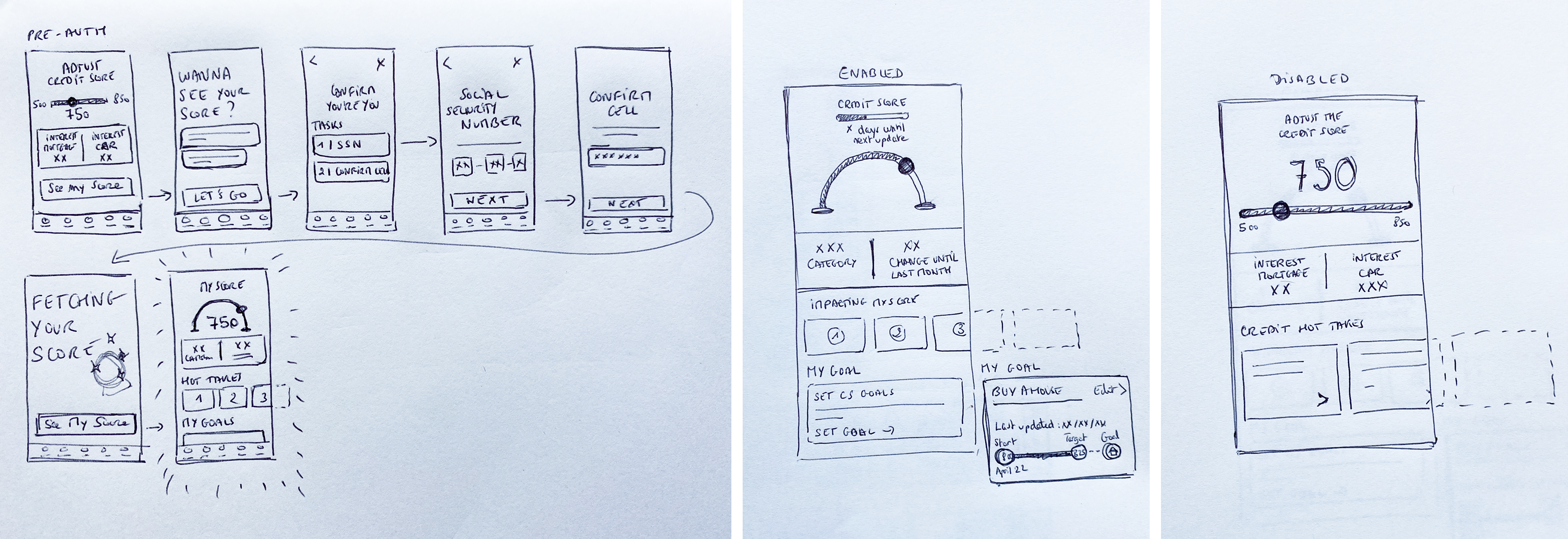
Some Sketches around Credit Score
Even if the MVP redesign was targeting the pre and post-authorisation experiences, it was important to consider the whole journey. Therefore I put together a user flow that included the wireframes for the new screens and provided a good overview of the whole experience.
That allowed me to ensure the experience made sense as a whole.
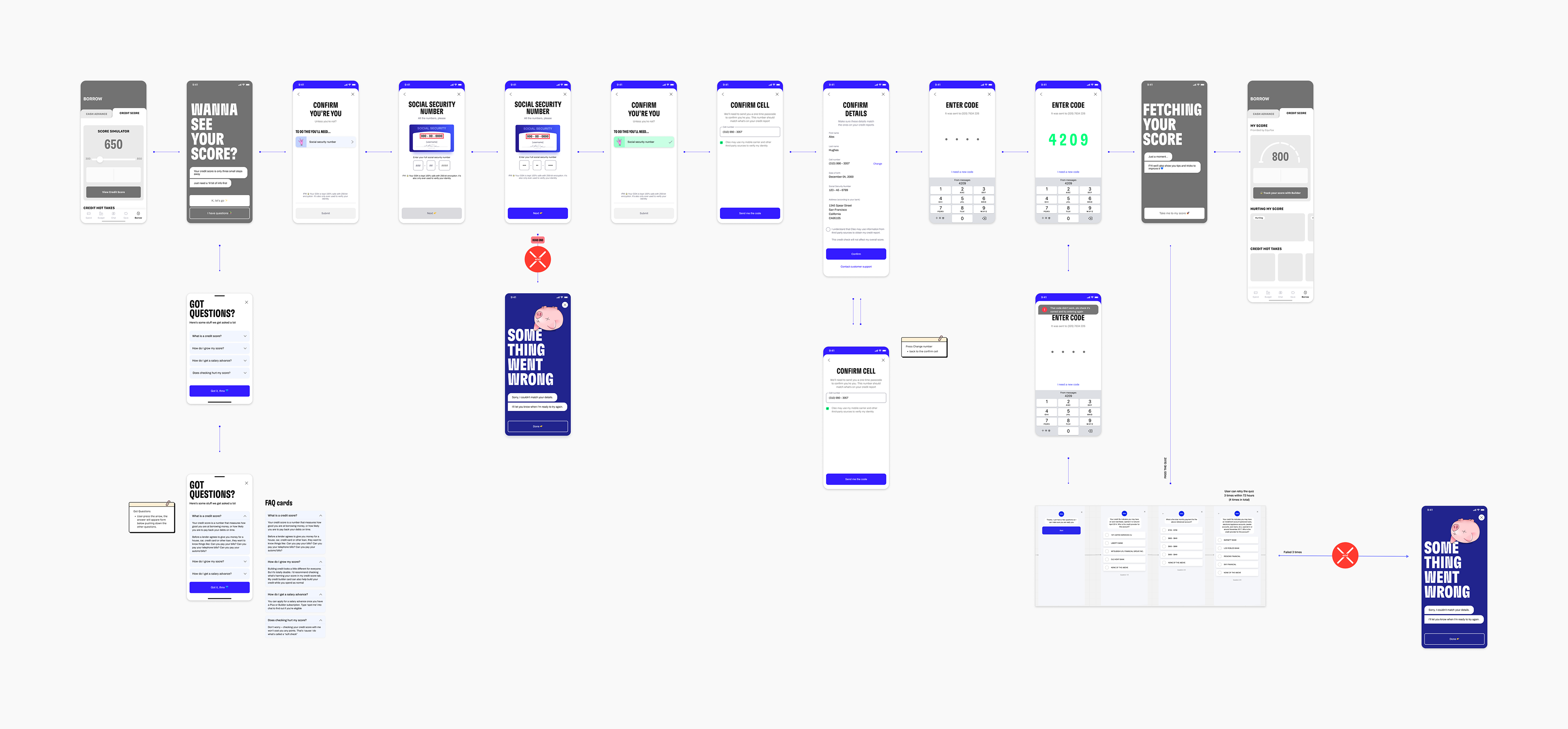
Credit Score User Flow (Pre Authorisation, Authorisation Flow & Post Authorisation)
Prototyping
& User Testing
USER TESTING
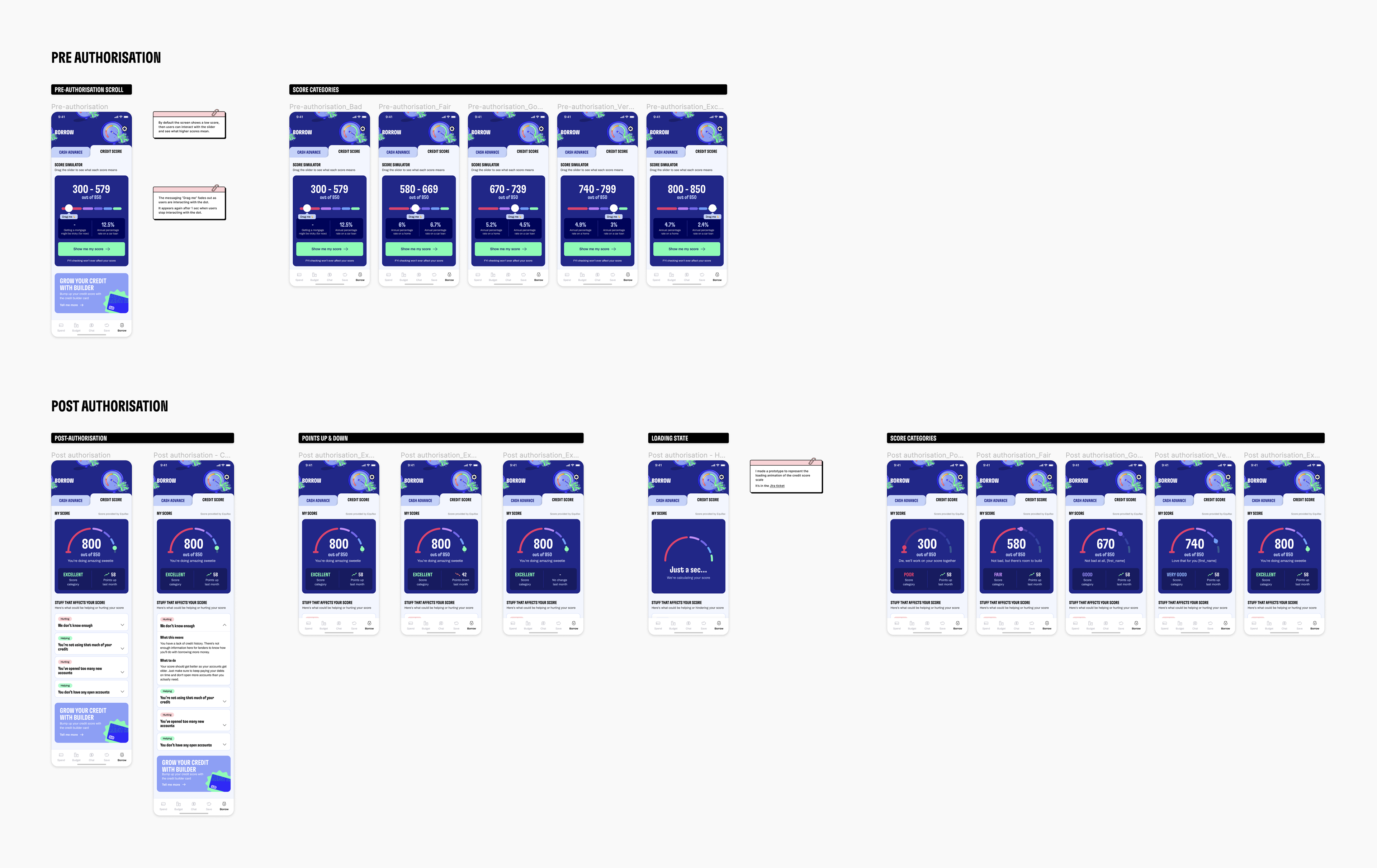
I created an interactive prototype and ran user testing sessions to validate the new direction.

Prototype for User Testing
Prototype for User Testing in action
I had a few no-shows but I was still able to conduct 7 user testing sessions. This provided valuable feedback:
• Users seemed happy about the new designs and thought it was very clear and usable. They understood easily what they were looking at and how to interact with it.
• They thought the pre-authorisation experience seemed very valuable. They enjoyed learning about how credit score affected real life projects and interest fees.
• They liked the new visual and illustration style, in line with Cleo's tone of voice
• Some users regretted the fact that they couldn't see how their score had evolved with time
After all user testing sessions, I ran a workshop to regroup with the squad, share the insights and collectively think about the next steps.
Workshop post User Testing Sessions - Sharing initial Thoughts & Themes
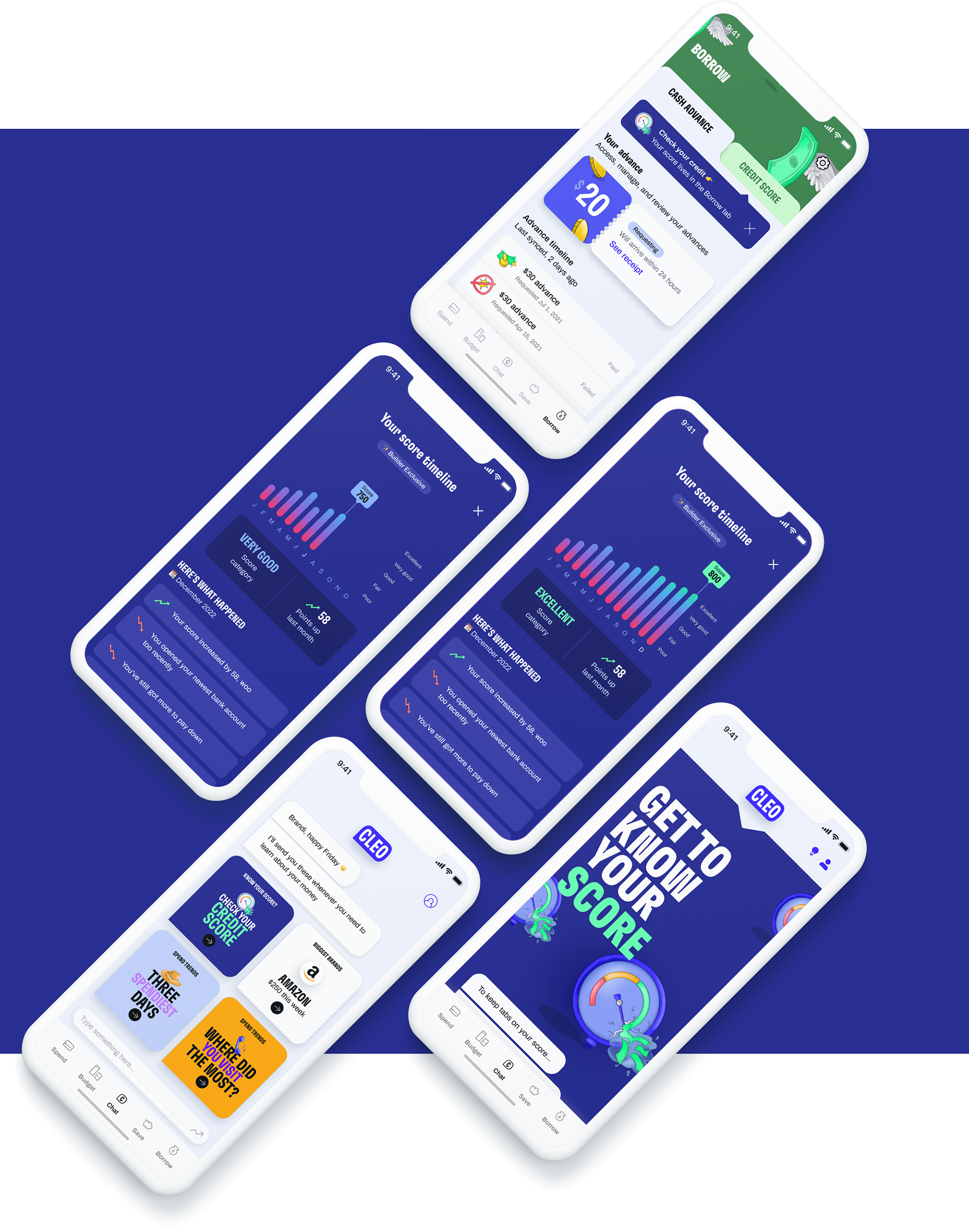
MVP Designs
FINAL VISUALS FOR MVP
The feedback following the user testing sessions was very positive overall. I amended and refined the designs a little (new illustration in the header among other things), and decided to keep the bigger suggestions for future iterations.
Handover to Developers with final designs for the MVP
The final MVP delivered:
• A clearer experience with less distractions
• A clearer experience with less distractions
• A valuable and educational pre-authorisation experience
• Actionable insights behind score change
• Micro-interactions to elevate the UI
The goal was to transform the feature from a static number into a guided and personal coaching experience.
The goal was to transform the feature from a static number into a guided and personal coaching experience.
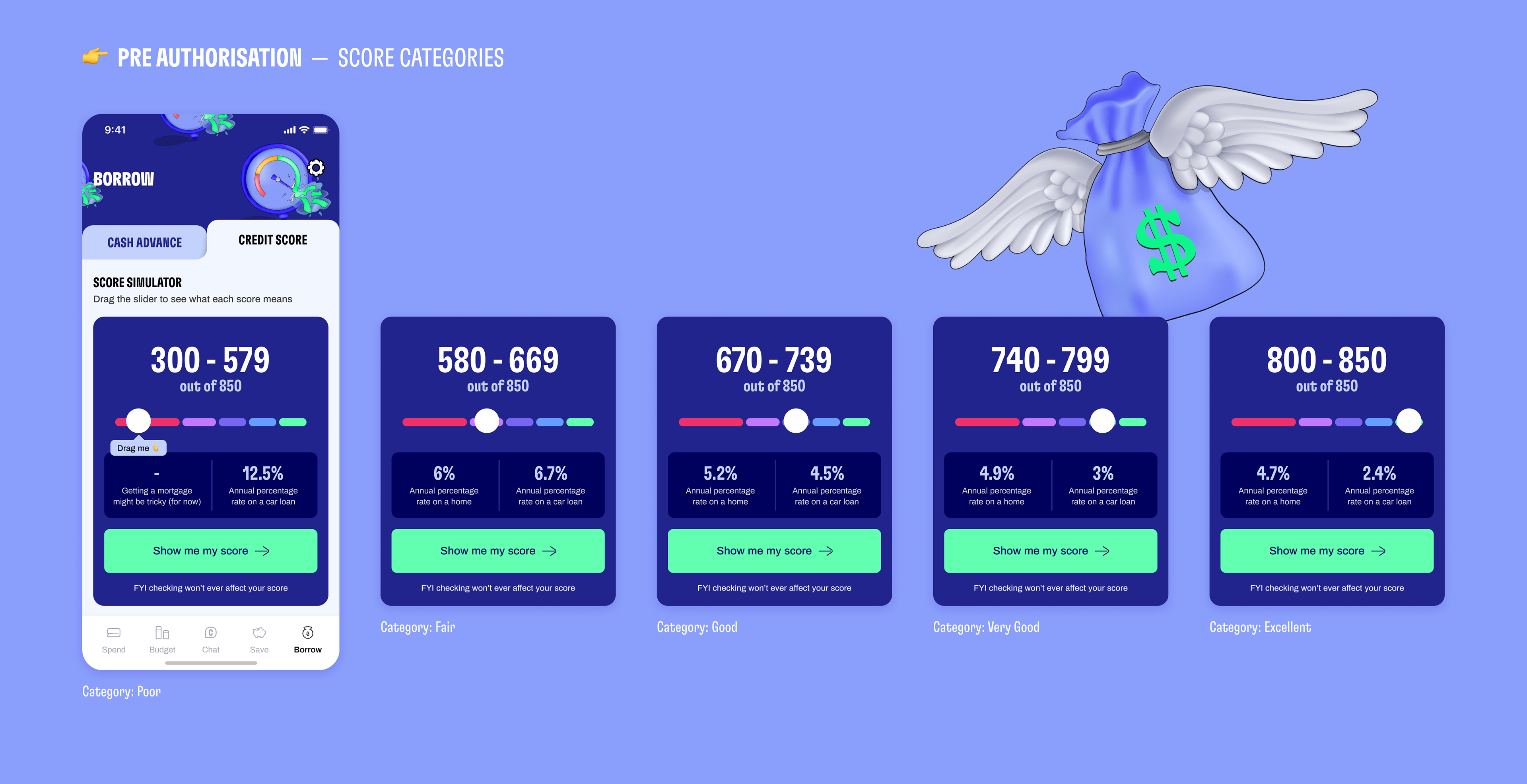
MVP Credit Score — Pre Authorisation
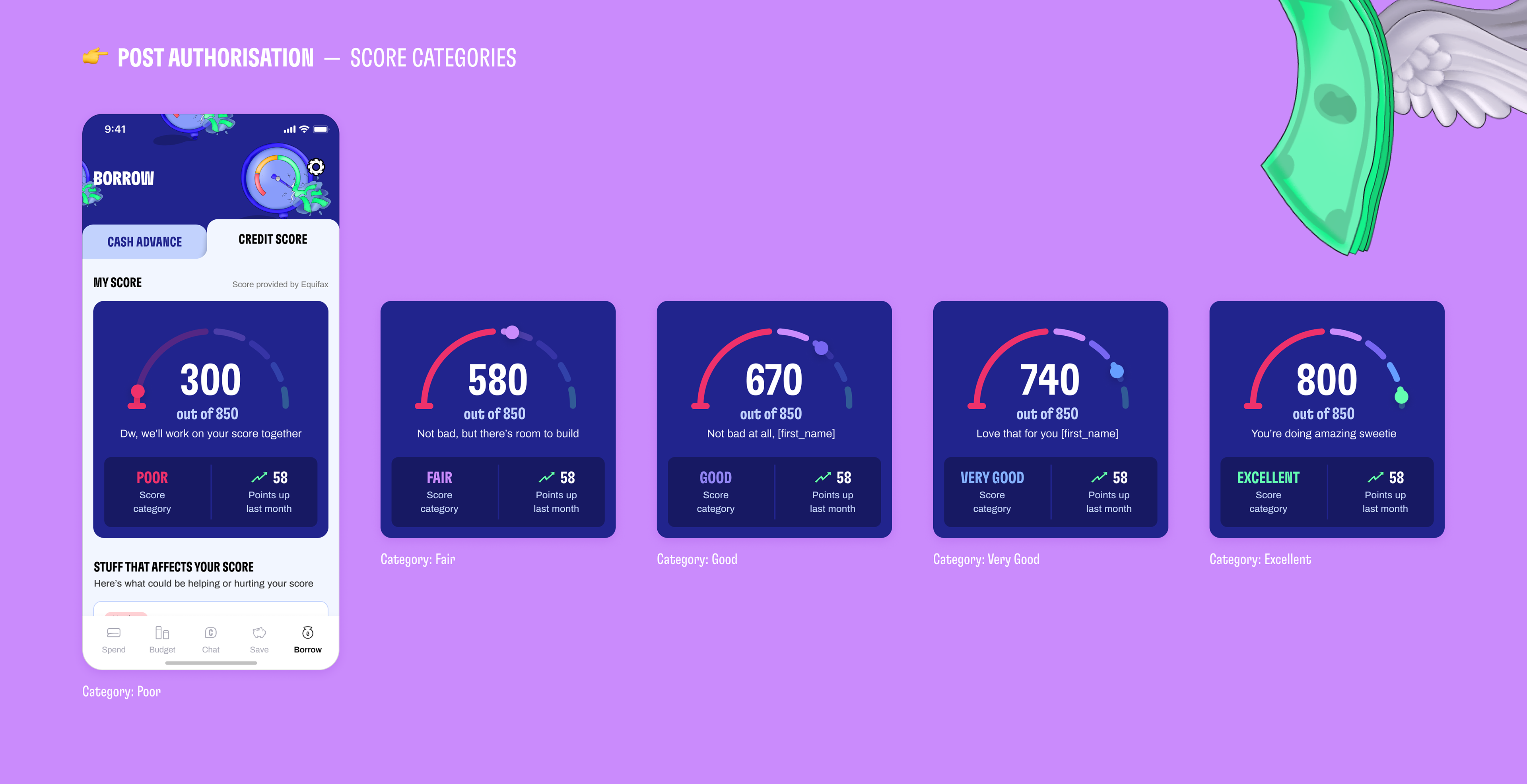
MVP Credit Score — Post Authorisation
I created the animations below in Principle to better visualize the micro-interactions and help guide the developers.
Prototype that represents the Interaction on the Header

Prototype that represents the Loading Animation of the Score
Results
OKR VS OUTCOMES
Target (OKR)
______
______
20%
of Plus users that check their score within their first 7 days
Achieved
______
9%
of Plus users that check their score
within their first 7 days
within their first 7 days
Our initial OKR target of +20% wasn’t fully met but we achieved around 9% (yay).
We also noticed:
• A 135% increase in users initiating the authorisation flow compared to control.
• Overall credit score pulls increased significantly (but lower because the authorisation flow was too long and needs to be redesigned next)
• The redesign was strong enough to be rolled out to 100% of users!
It showed we were moving in the right direction, although the long authorisation flow still limited performance.
LEARNINGS
This project reinforced a few things for me:
• An edgy tone of voice and illustrations are nice, but they can be distracting and/or confusing. They should never be used at the expense of clarity.
• A valuable feature isn't valuable anymore if users don't understand it. Even though the credit score was objectively valuable, users only looked at the number and didn’t know what to do with it.
• When a feature is unfamiliar or complex, clear educational content makes a difference. In this case, illustrating the impact of credit score in a visual and playful way encouraged users to engage and start the process of checking their own score.
WHAT NEXT?
There were additional opportunities to explore, some of which we implemented:
• Streamline the onboarding flow to minimize drop-off and increase completion rates
• Improve feature discoverability. Investigate how to bring the credit score more contextually across the app.
• Further integrate the credit score into the conversational AI experience to make it feel less like a static dashboard and more like ongoing coaching.
Iterations & Additions that followed the MVP Release