Various UX / UI projects - Involving the watch, Pop-up Shazam on Android, etc.
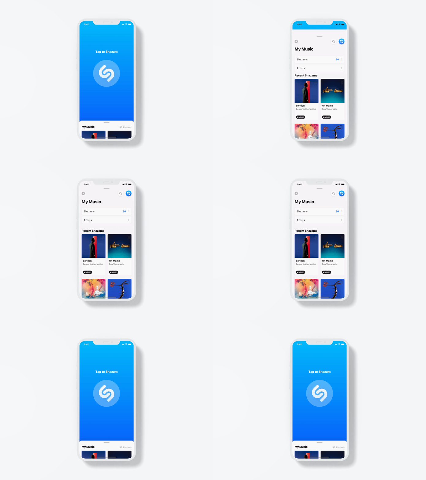
Shazam on WatchOS with a new navigation
THE ROLE
Shazam
iOS & Android Apps, Wearables Design
Involvement
UI/UX Design
iOS & Android Apps, Wearables Design
Involvement
UI/UX Design
THE PROJECT
Shazam is a globally used and well known app that identifies music around you, based on a short sample of sound and using the microphone on the device. The app has 1 billion installs and counting. It has been owned by Apple since 2018.
During my time at Shazam, I've been lucky to work on various projects on Apps, Web and wearables.
The projects have been varied, from maintaining and improving the app's core experience to bringing more subscribers to Apple Music.
The projects have been varied, from maintaining and improving the app's core experience to bringing more subscribers to Apple Music.
____________________________________
This page contains:
• Shazam on the watch
• Pop-up Shazam
• Apple Music Subscriptions
• Shazam on the watch
• Pop-up Shazam
• Apple Music Subscriptions
Shazam on the watch before and after the change of the navigation
SHAZAM ON THE WATCH
I have been involved in a few projects involving Shazam on WatchOS.
The most significant change while I was there has been a redesign and a change of the navigation. The Library with the previous Shazam was originally on the main screen, with the cards peaking at the bottom. We've decided to move away from that custom layout and adopt a dotted navigation. This is a very common pattern on WatchOS. Therefore I have redesigned the app with the Library accessible when users swiped right.
At the same time, I have designed a notification for the app, which would allow users to get notified when a song they Shazamed offline has been found.
New screens for Shazam on WatchOS
Animation of the new Home screen made with Principle
Introduction of Shazam offline and the notifications that come with it
____________________________________
Raising Pop-up Shazam awareness on Android
POP-UP SHAZAM
Pop-up Shazam is a unique feature exclusive to Android, that enables users to use Shazam above other apps. The Shazam button is always be visible on the screen, and can be moved wherever users like. When users Shazam a song, they can see the song and artist names, before the lyrics appear.
It is a very valuable feature for Android users, who can Shazam a song on Instagram for example, when iOS users have no equivalent way to do it. Unfortunately the feature is used by a small percentage of Android users only. Unless users are curious and find the "Pop-up Shazam" mention in the app settings, they wouldn't know about it.
Therefore, I have tried to address that issue and raise Pop-up Shazam awareness, as well as making its value clearer to users.
Pop-up Shazam (first row) and Pop-up Shazam announcements (second row)
I knew I wanted to improve Pop-up Shazam awareness, but I had to figure out how and where to do that. I have designed 2 solutions:
• Home screen banner
I thought it would be very hard to miss if the message was living on the Home screen. I kept the UI very simple for this one, as this is not an add and I didn't want it to look like it. When they click on it, users are taken to a screen where they can read more about the feature. I've created an animation to show how Pop-up Shazam works above users favourite app (in my design, Instagram and Youtube).
I thought it would be very hard to miss if the message was living on the Home screen. I kept the UI very simple for this one, as this is not an add and I didn't want it to look like it. When they click on it, users are taken to a screen where they can read more about the feature. I've created an animation to show how Pop-up Shazam works above users favourite app (in my design, Instagram and Youtube).
• Pop-over in the Lyrics screen
Pop-up Shazam displays the song lyrics, therefore I thought it would be interesting to tell users interested in lyrics they could sing along to songs playing in other apps. From there, I have designed a pop-over on the Lyrics screen, that would take users directly to their settings so they can enable Pop-up Shazam.
Pop-up Shazam displays the song lyrics, therefore I thought it would be interesting to tell users interested in lyrics they could sing along to songs playing in other apps. From there, I have designed a pop-over on the Lyrics screen, that would take users directly to their settings so they can enable Pop-up Shazam.
With both these placements we've seen a significant increase in the number of users enabling Pop-up Shazam.
____________________________________
Raising Apple Music Subscriptions
APPLE MUSIC SUBSCRIPTIONS
These are a few tests and designs done to drive more users to Apple Music. We focused on the screens with the most traffic to increase the visibility of Apple Music.
Therefore we have added a button in the track page, used the announcement banner in the homepage and added a card in the Library, among other things.
Here are a sample of the designs I have put together in order to bring more users to Apple Music.
Here are a sample of the designs I have put together in order to bring more users to Apple Music.
Prototype of the 4 months offer in Russia
Addition of an animated equalizer to drag more attention to the CTA
Track Page Context
The track page is one of the most visited screens of the app. Users see it each time the app recognises a song. It makes sense to have a button on this screen so users can listen to the song in full in Apple Music (since they only get a 30 seconds preview on Shazam).
Design
The pill we came up with for the Track page is made of the CTA that says "Open to Apple Music" and an animated line of copy underneath to give users more informations about the offer (such as the length).
Once we came up with a design we liked for the pill, we tried it in different languages (including Russian above; or english on the image before) to make sure the copy wouldn't be too long for the CTA.
Results
The addition of the CTA resulted in many clicks and a significantly higher number of new users to Apple Music coming from Shazam.
The addition of the CTA resulted in many clicks and a significantly higher number of new users to Apple Music coming from Shazam.
Holiday offer on the home screen
In order to bring more users to Apple Music, we promoted a "holiday offer" on the home screen. Users were prompted to try Apple Music with one additional month free, so five months in total.
Home announcements are from far the best placements in app to show something to users, as they get the most visibility (see design in the Shazam Rearchitecture project). The illustrations have been designed for the occasion, and we've designed 3 messaging for the offer. The main one is meant to introduce users to the offer, then they get a reminder ("Don't miss out") and they are prompted to invite their friends.
