A case study showing the redesign of Shazam's structure, from ideation to final visuals.
THE ROLE
Shazam
iOS & Android Apps
Involvement
UX / UI Design
iOS & Android Apps
Involvement
UX / UI Design
THE PROJECT
Shazam is a globally used and well known app that identifies music around you, based on a short sample of sound and using the microphone on the device. The app has 1 billion installs and counting. It has been owned by Apple since 2018.
I have worked on this big app redesign project in a team of 5 designers (1 lead designer and 4 product designers). We quickly shared our thoughts and ideas with the product managers and developers and worked on this project in a cross-functional and collaborative way.
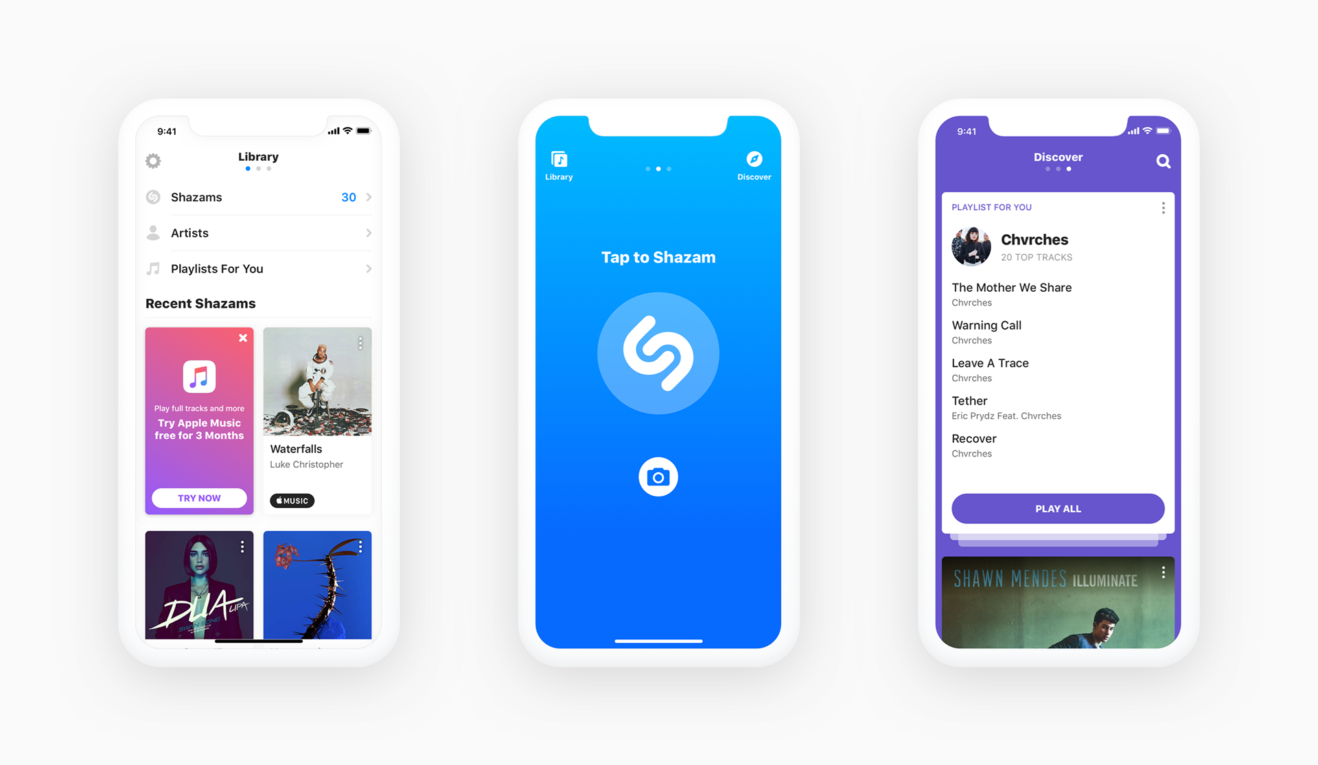
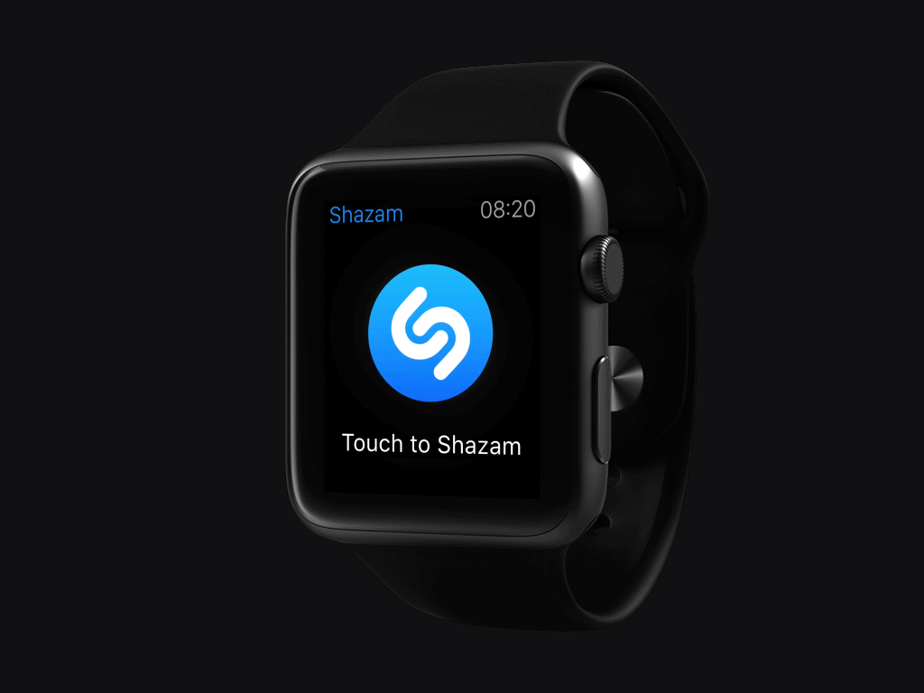
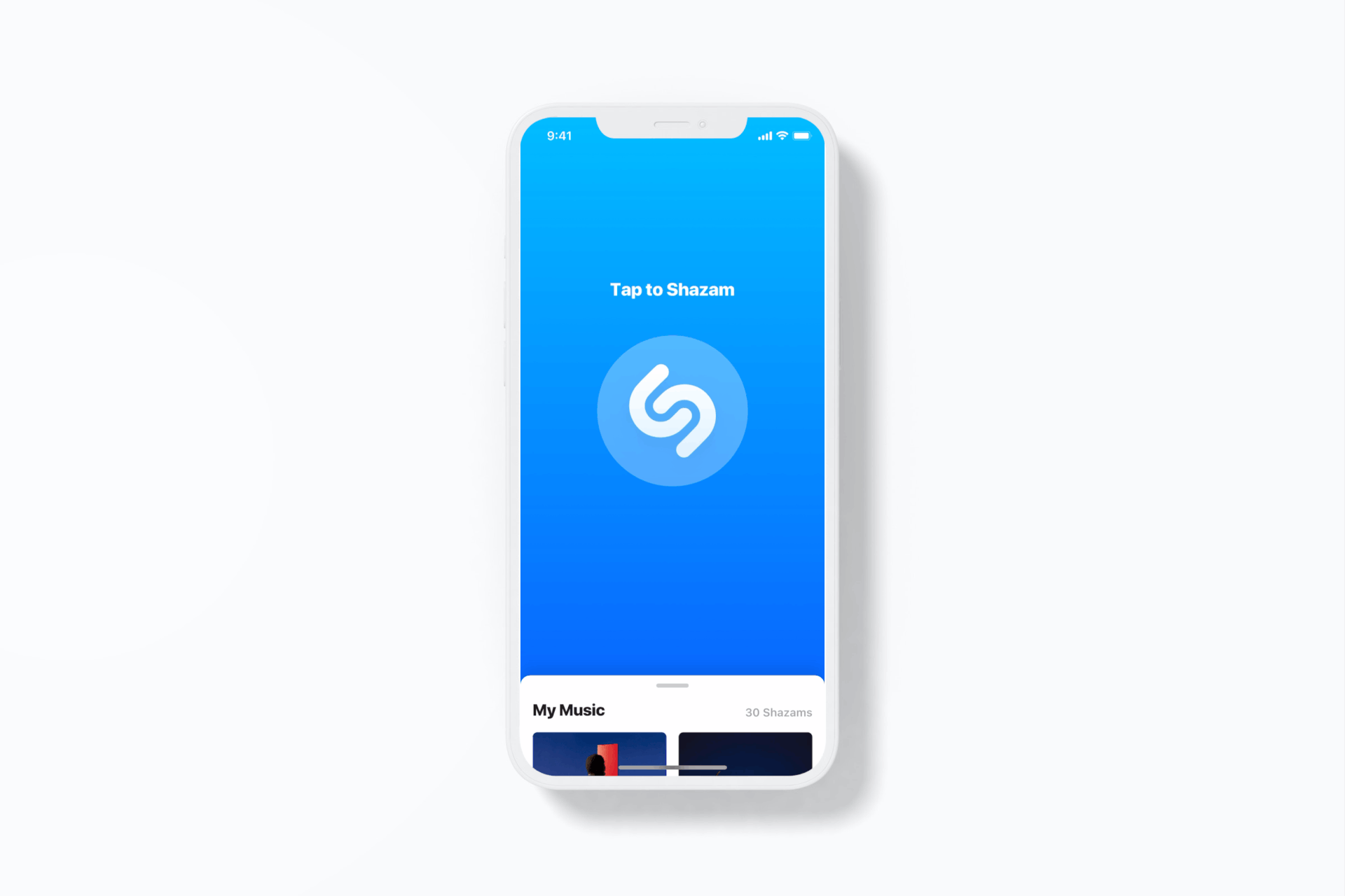
These screens show the app before the rearchitecture
CONTEXT
We were a team of 5 Product Designers, and our Head of Design, usually based in San Francisco, was in London for a week.
We took this opportunity to come together for an intensive week of brainstorming and design sprints to explore how we could modernise and further leverage the app.
PROBLEM & STRATEGIC GOALS
We made a few observations as to why the app needed to be redesigned.
• The app navigation and general design had not been updated in 3 years. We wanted to give it a fresh look and feel.
• Data showed that users were not interested in the 'Discover' tab and scrolling through it. Showing users a variety of random music recommendations did not drive engagement.
• Data showed that users were not interested in the 'Discover' tab and scrolling through it. Showing users a variety of random music recommendations did not drive engagement.
• If we were removing the `Discover` tab, the static navigation with 3 tabs could not exist anymore.
• Since Shazam had been acquired by Apple their primary goal was to bring more users to Apple Music. Therefore we were always looking for ways to increase clicks on the Apple Music upsell and signups.
GOALS
The main objectives of the redesign were the following:
• Simplify our app architecture to improve the way people discover music.
• Increase engagement with the Library and the Track screen, if possible by bringing Library to Home.
• Increase clicks and signups to Apple Music.
THE EXPLORATION
We started the project with a series of design sprints involving our team of 5 product designers.
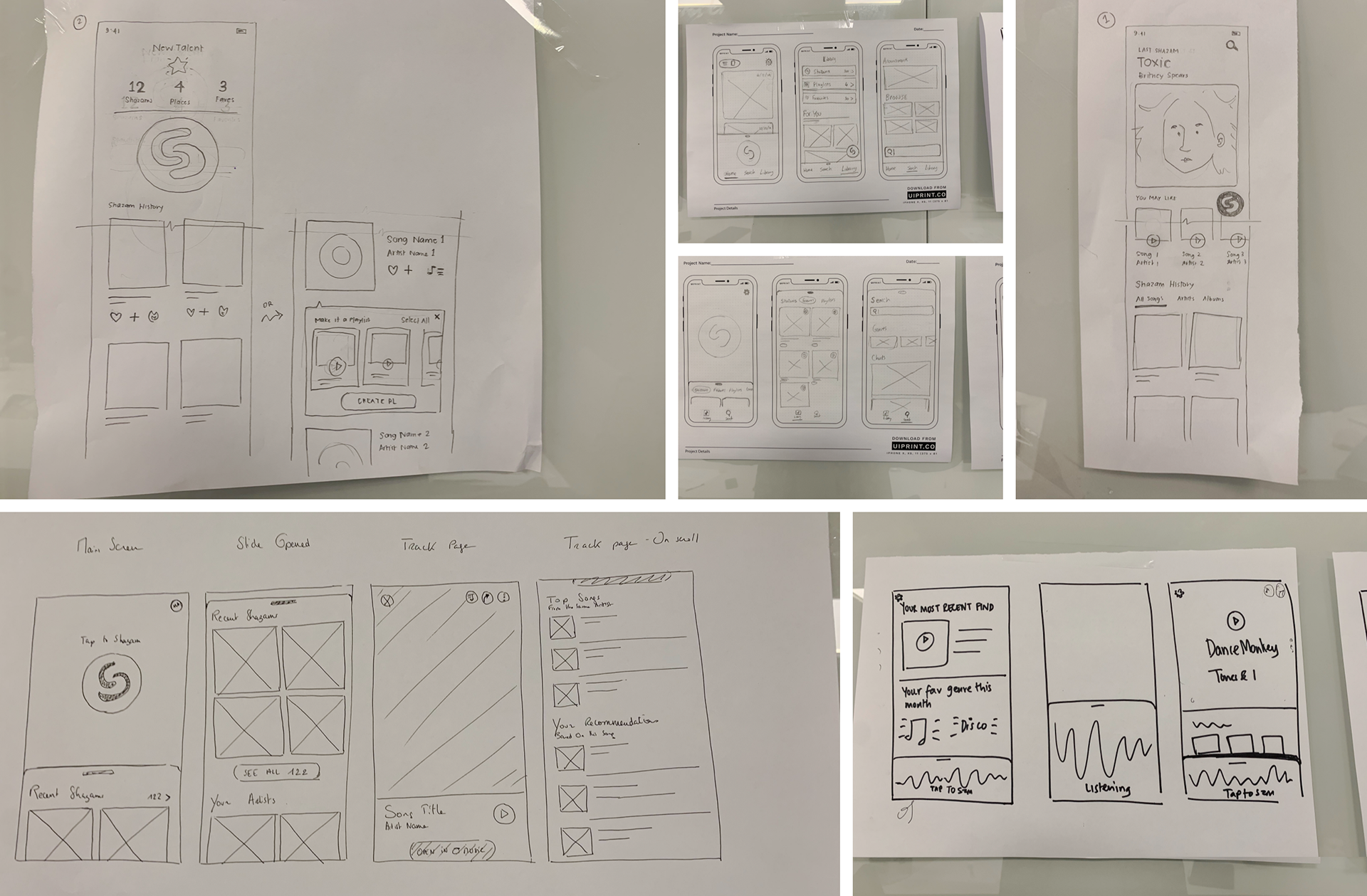
Multiple whiteboarding and idea generation sessions
THE WIREFRAMES
We realised there were a few themes and ideas that we had in common and that kept coming back. We then put together a list of "must have" the redesign should try and address:
• Shazam access at all times
• Move on from the navigation with tabs - Vertical Scroll with card preferred
• Bring Library to Home
• Surface new Shazams on Home
• Recommendations come in the form of playlists
• Create personalised Shazam stats (Not essential for MVP)
• Move on from the navigation with tabs - Vertical Scroll with card preferred
• Bring Library to Home
• Surface new Shazams on Home
• Recommendations come in the form of playlists
• Create personalised Shazam stats (Not essential for MVP)

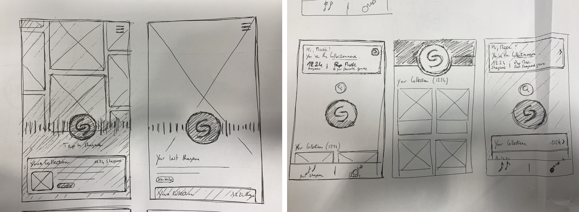
A handful of exploratory wireframes, aiming to explore very different UX for the app
We started wireframing and after a few iterations we came up with a navigation we liked, where the library would be located on a card accessible with a swipe up gesture.
I put together a User Journey that mapped out all the screens impacted by the redesign.
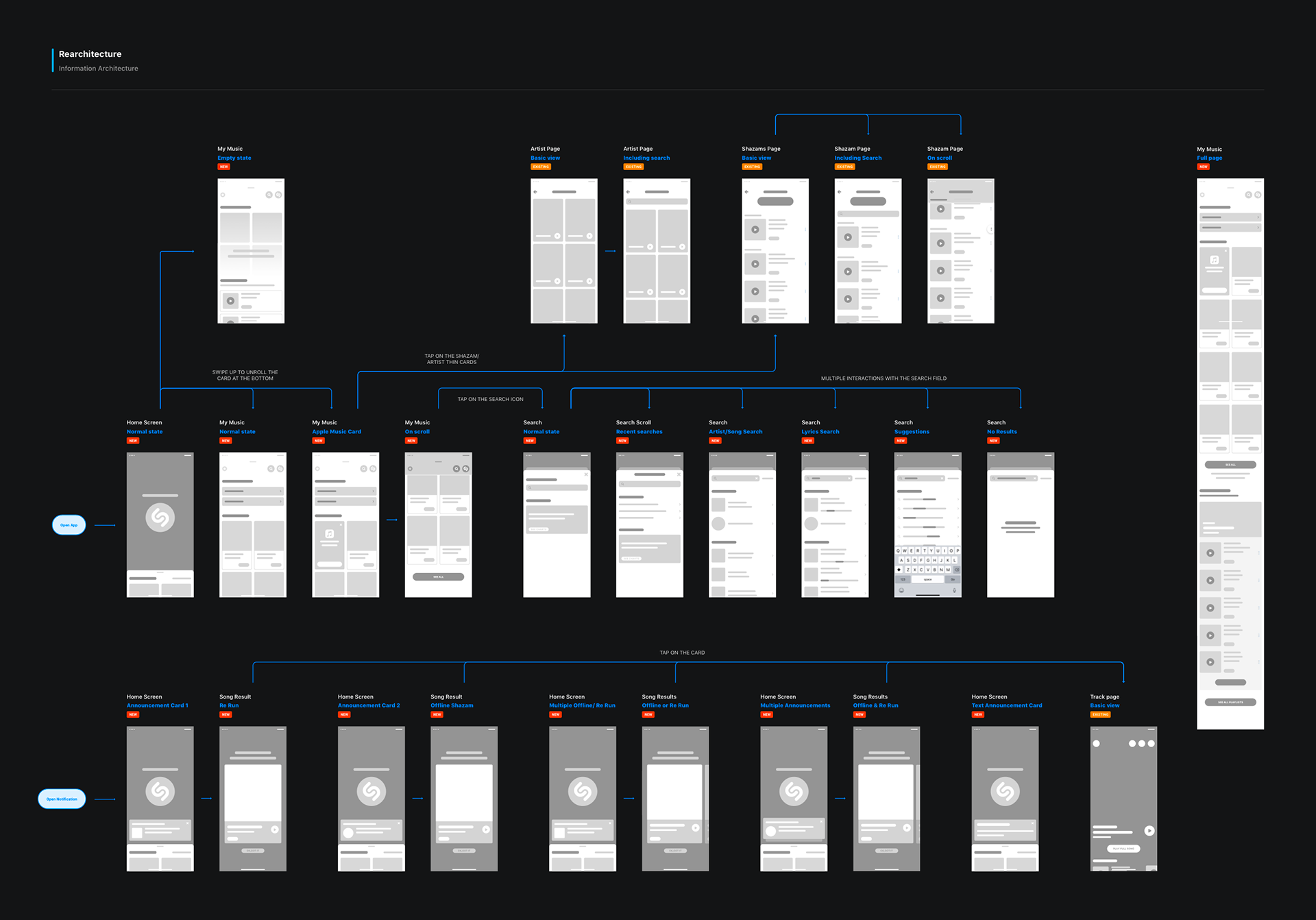
The Wireframe document that served as a solid starting point for the project
UI REFINEMENT
In parallel, I did some UI explorations. At this point, we were wondering if the rearchitecture of the app should include a deeper redesign of the Home screen, a change of the animation of the button, etc.
I went for a minimalist layout that makes the Shazam button the centre of attention, and makes the experience as intuitive and clear as possible. The UI is not dramatically different from the previous version of the app, but still addresses the main things that needed to change.
It does bring Library to home, makes the last Shazams easily accessible, simplify the navigation and access to the content. The "Discover" tab that contained cards with various things on it (music recommendations, charts, etc.) got removed, as most users were not opening this tab or scrolling through the content.

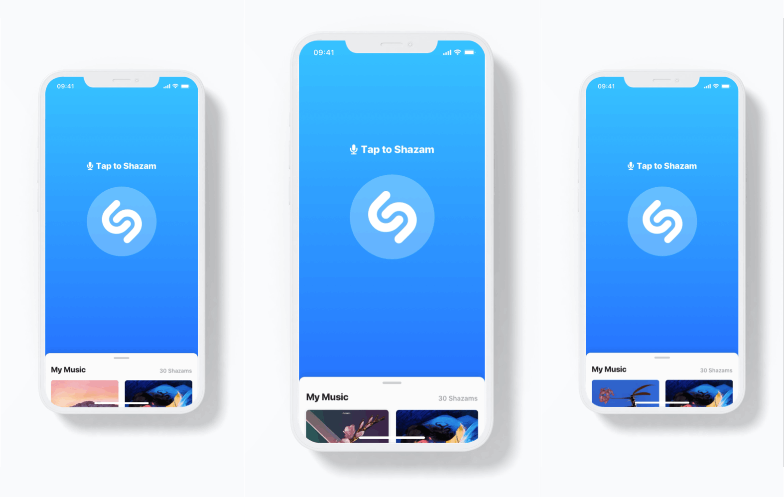
Final designs of most screens impacted by the Rearchitecture - for all devices
Visual made with the new screens
I added "Home announcement" cards on the Home screen, to let users know about important informations, such as a new Shazam found for a song they've Shazamed when they were offline, or a new addition to the catalog.
Prototype with homepage announcements
Below is a detailed logic for the home announcements, as well as some guidelines for developers.

Homepage announcements logic
ROLL OUT PLAN & EXPECTATIONS
We came up with a phased roll out plan so we could control a few indicators and pause the roll out if anything came up or went wrong.
We were expecting to see an existing user bias in the beginning, as they would probably display a different behaviour due to the new experience. We anticipated the Library usage could be up initially as they explore the new design (as we see when shipping new features), but we thought we could also see a dip as Library users need to learn a new behaviour with the updated UX.
We have been tracking the following metrics:
• Daily Active Users (DAU) going to My Shazam
• DAU Shazaming
• DAU going to track page
• DAU clicking to Apple Music
• DAU Shazaming
• DAU going to track page
• DAU clicking to Apple Music
RESULTS
We noticed an increased interest for the Library and the Track page in the beginning, as expected.
After a month, we observed a lot of improvements:
• Increased engagement with the Library and its content
• The DAU going to the Track page was more important
• More clicks to the Apple Music upsell and more subscriptions to the offer
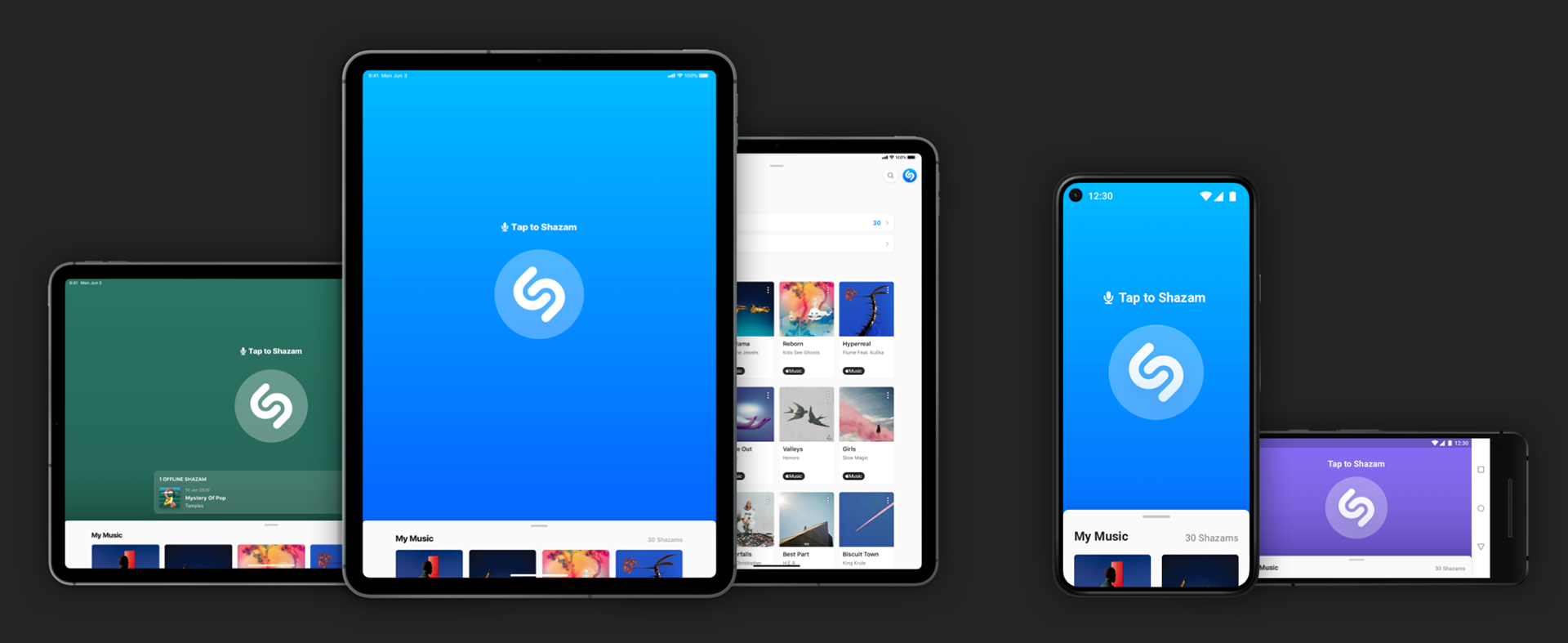
Other devices designs - Here the iPad, Google Pixel 5 and Google Pixel 2 (Landscape)
LEARNINGS
This rich project taught me a few things along the way:
• Sometimes simplicity is better. I simplified the navigation, removed the unnecessary content and went for a minimalist design. But it had a great impact on content discovery, engagement, and conversion to Apple Music.
• The exact same content can have a different impact depending of its location in the app. Here, the library swipe-up card was almost exactly the same (just some very minor UI tweaks), but putting it in a different place made a huge difference.
• Emotional continuity matters. Shazam has a well known brand identity. I had to find the right balance between innovation and familiarity.