Improvement of the subscription flow that led to +13% conversion (+22% conversion to the most expensive plan)
THE ROLE
Cleo
iOS & Android Apps
Involvement
UX / UI Design
iOS & Android Apps
Involvement
UX / UI Design
THE PROJECT
Cleo is a money management app that helps people with their finance health.
Based on AI, the app provides a clever chat experience. Cleo talks like a big sister that will call out the objectionable money behaviours without shaming users. This aims to remove the stress and guilt people can feel when they check their finances.
I worked as the sole designer on the project, along with a PM, developers, a UX Researcher and a UX Writer.
____________________________________
Context
THE PROBLEM
As the sole product designer on a cross-functional team at Cleo, I led the end-to-end redesign of our premium subscription onboarding experience. Cleo offers two paid plans, Plus and Builder, with separate sign-up flows built by different teams. These flows were inconsistent, overly long, and difficult for users to compare or upgrade between.
This led to a few issues:
• Confusion about plan differences
• Difficulty upgrading from Plus to Builder
• No easy way to compare plans
• High drop-off rates due to long, inconsistent flows
• No “unhappy path” if Builder sign-up failed (e.g. failed KYC or affordability check)
Plus & Builder signup flows before the project
RESEARCH INSIGHTS
In collaboration with the User Researcher, we spoke with recent Cleo users and found:
• Many users weren’t aware of Builder early on
• Users couldn’t clearly compare Builder vs Plus
• Plus users didn’t know they could upgrade
• Most users preferred a single, simplified flow
OUR APPROACH
I facilitated a cross-functional ideation session among the product team, to discuss the objectives and the risks of the project.
Cross-functional ideation session on Miro
____________________________________
Goals & HMWs
STRATEGIC DECISION
Some stakeholders initially proposed focusing only on smaller goals, such as the upgrade path from Plus to Builder. I advocated for working on the full consolidation flow, and these were my main reasons:
• Keeping focus on the big bets: I was worried we would get lost in lots of small changes instead of going for the most impactful changes
• A unified flow was the most impactful move to me, for 2 reasons.
Future testing: A unified flow is more flexible for A/B testing and incentive changes.
Strategic alignment: Sets a better foundation for future unified premium offerings.
Future testing: A unified flow is more flexible for A/B testing and incentive changes.
Strategic alignment: Sets a better foundation for future unified premium offerings.
• Opportunity to have an overview on the whole flow, so it makes sense from A to Z
• Upgrade paths become easier to build if both flows start from the same structure.
In the end, we aligned on a 4 steps phased implementation to minimise risks in this ambitious project.
GOAL
We want to create a consolidated sign-up flow that removes unclarity, inconsistencies and unnecessary steps.
HYPOTHESIS
By creating a consolidated and clearer sign-up flow, we can reduce drop-offs and increase conversion to either subscription plan.
HMWs
Primary opportunity: HMW help users better understand our premium offering and decide a plan which best suits them?
Additional ones:
• HMW allow users to compare plans side-by-side
• HMW reduce Builder sign-up drop-offs
• HMW re-engage free users who drop-off the Builder sign-up flow
• HMW reduce friction for Plus users to upgrade to Builder
• HMW allow simpler upgrades to Builder (any stages which relate to the card will be moved to after upgrade)
____________________________________
Explorations
I started the ideation process by 2 things.
First, I put together a consolidated user flow for Plus & Builder.
Premium consolidation proposed flows
Then, I tackled the UI explorations for key new screens such as the consolidated upsell screen. This was challenging as there were A LOT of informations to put in a small screen.
I did initial UI explorations that raised a few issues:
• They were not allowing detailed comparison of the 2 plans side by side
• The team working on the Plus subscription was worried that putting "Builder" first would affect sign-ups to Builder
• I was advised to show Boost differently in the list of Builder advantages so it stands out more
UI explorations for the consolidated upsell screen
I created another version that resolved the issues that had been raised. The new design made it possible to compare the two plans side by side, which was exactly what we were aiming for.
____________________________________
Final flow
I iterated on the flow and refined the UI for key screens, resulting in a final version ready for testing.
The consolidated flow, while still extensive, was approximately 15% shorter for Builder.
____________________________________
Outcomes
Since rolling out the first phases of the new flow:
• +18% increase in Plus subscriptions
• +22% more upgrades from Plus to Builder
• Reduced onboarding time by 30%
• Built flexibility to test new pricing and incentive models
• Internal teams aligned around a single, consistent experience
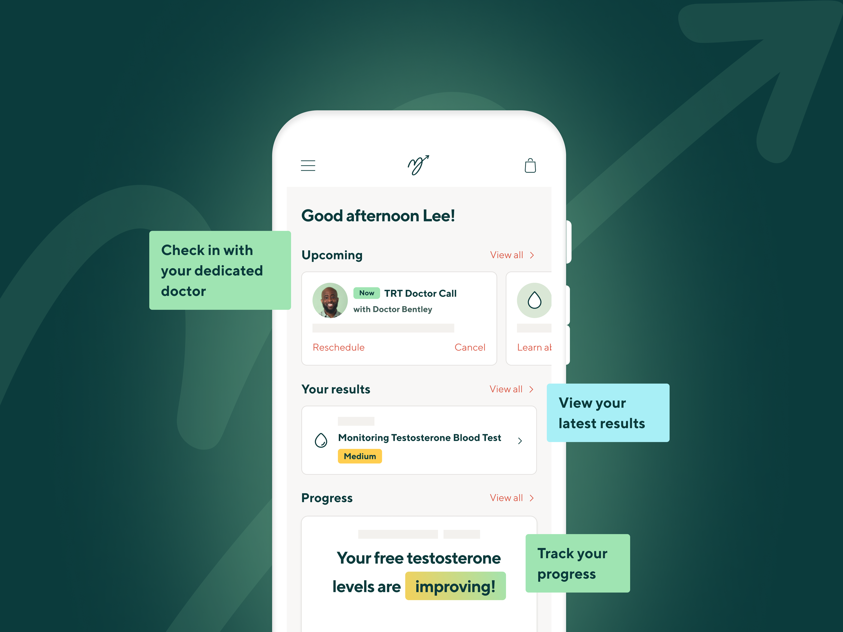
Close-up on a few key screens
