A case study showing how a new content I designed improved conversion by +20% for low intent users.
THE ROLE
MANUAL
Website Design
Involvement
UX / UI Design
Website Design
Involvement
UX / UI Design
THE PROJECT
MANUAL is transforming men’s health. They tackle life-limiting issues such as hormonal imbalance, obesity, and hair loss. Through easy at-home diagnosis and engaging treatment plans, MANUAL makes better health achievable for their customers.
I joined as a contractor for 4 months and mostly worked in a squad focusing on low testosterone diagnosis and treatment. I worked as the only UX/UI designer on the projects, along with a Growth Manager and, at times and when needed, a UX writer.
____________________________________
Context
The project took place in the low testosterone landing page. We focused on the low intent customers as we noticed they have specific needs. These customers mostly come from ads on socials and research showed they don't know much (if anything) about treatments for low testosterone.
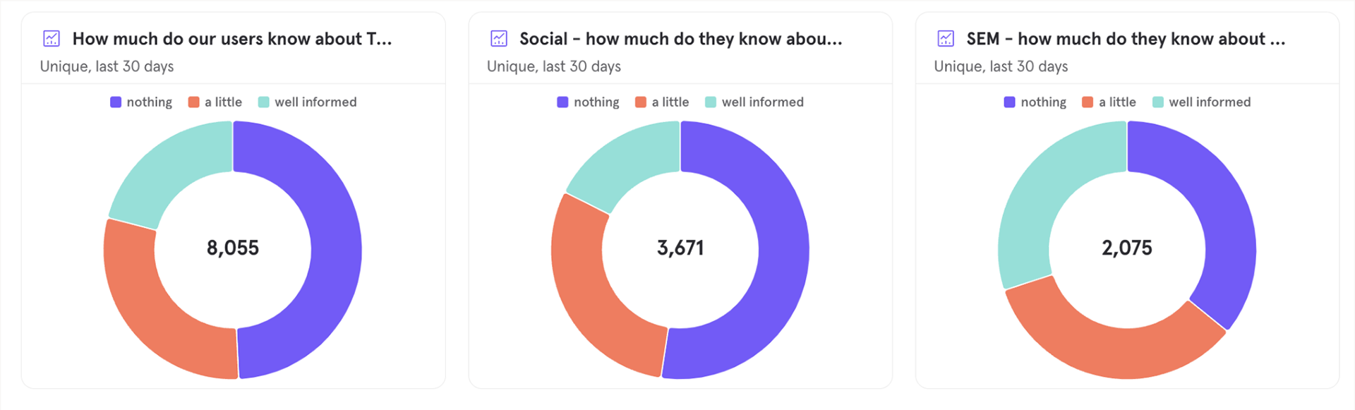
Data exploring the type of user and their knowledge about TRT
____________________________________
Objectives
PROBLEM
Low-intent users with little knowledge of TRT are unlikely to convert. Even when they do, their return rates for tests remain very low. Since they are not deeply engaged, they tend to drop out of the funnel sooner or later.”
GOAL
The goal was to improve conversion for low intent users, as well as improving return rates for the blood tests 1 and 2. Which means we needed to make low interest users interested enough to purchase the test and remained engaged over time.
HYPOTHESIS
These low intent users don’t have a clue what TRT is. Educating on TRT and how it works at MANUAL could improve conversion.
HMW better explain what TRT is?
HMW better explain what TRT is?
____________________________________
Ideation
I facilitated a brainstorming session on Miro to understand the thoughts of our lower to higher intent customers. Myself and the growth manager on the projects could visualise the specific questions low intent users might have.
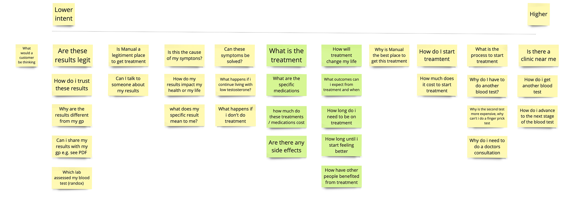
Early project ideation session
I decided the designs should focus on the following goals:
• Reassure users that MANUAL is a trustworthy and credible source for treatment
• Clearly show what the treatment process looks like at MANUAL
• Offer a preview of the user interface after completing the test
____________________________________
UI Visuals
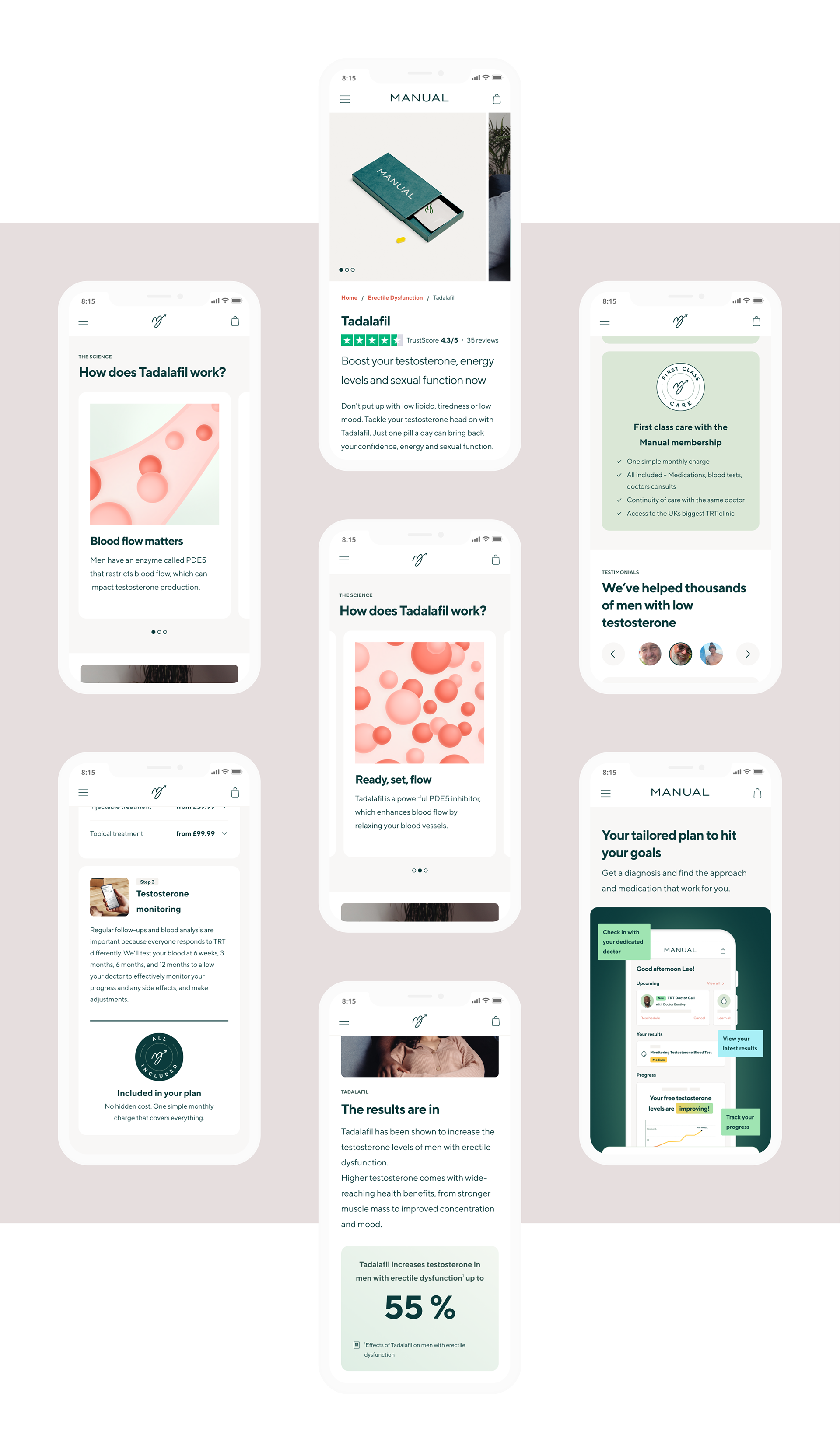
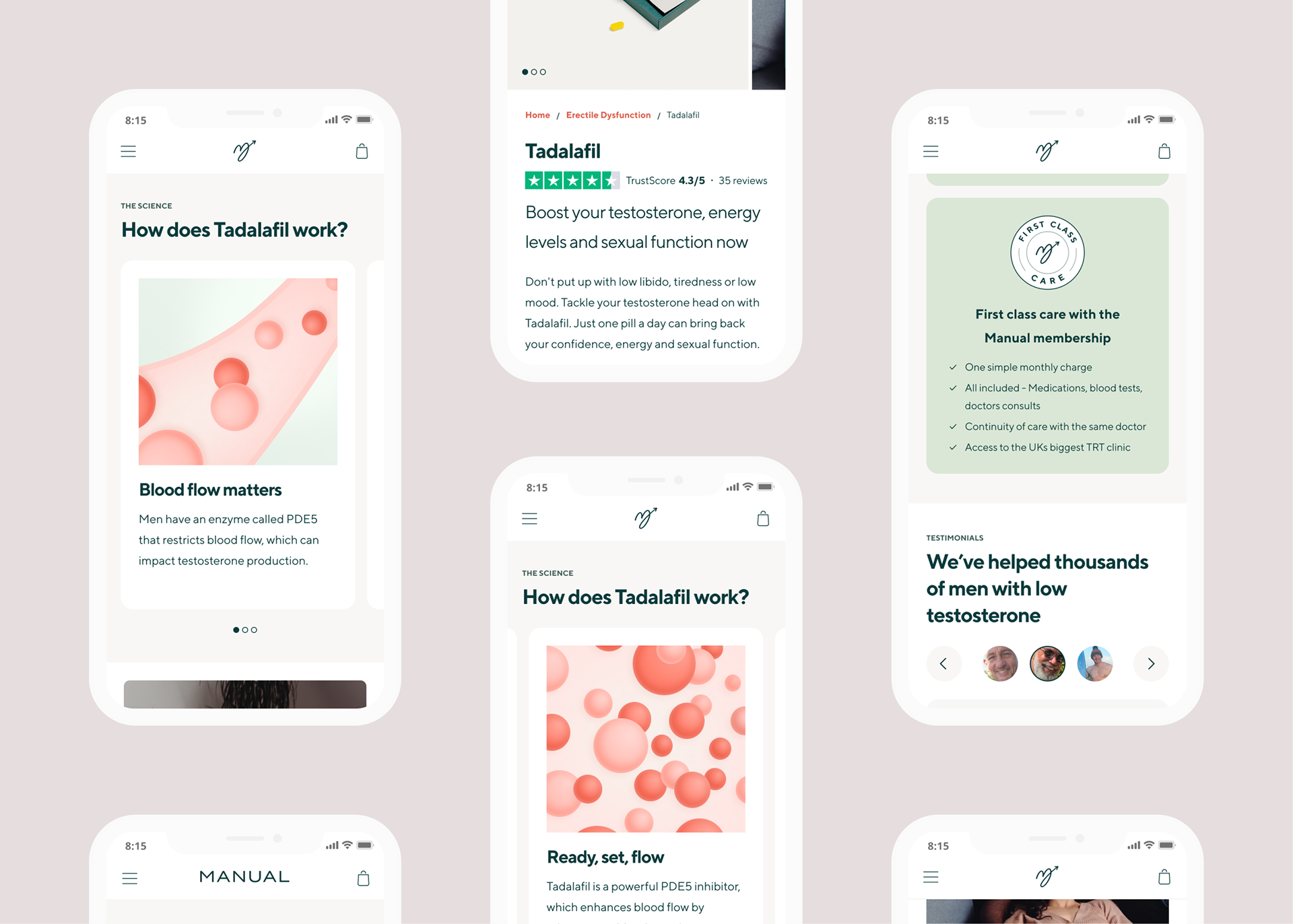
I designed 2 variants. Variant 1 aimed to be more visual and shows a sneak peak of the dashboard and functionalities users will get access to. Variant 2 doesn't have a visual but caters for a lot more content thanks to an expandable component.
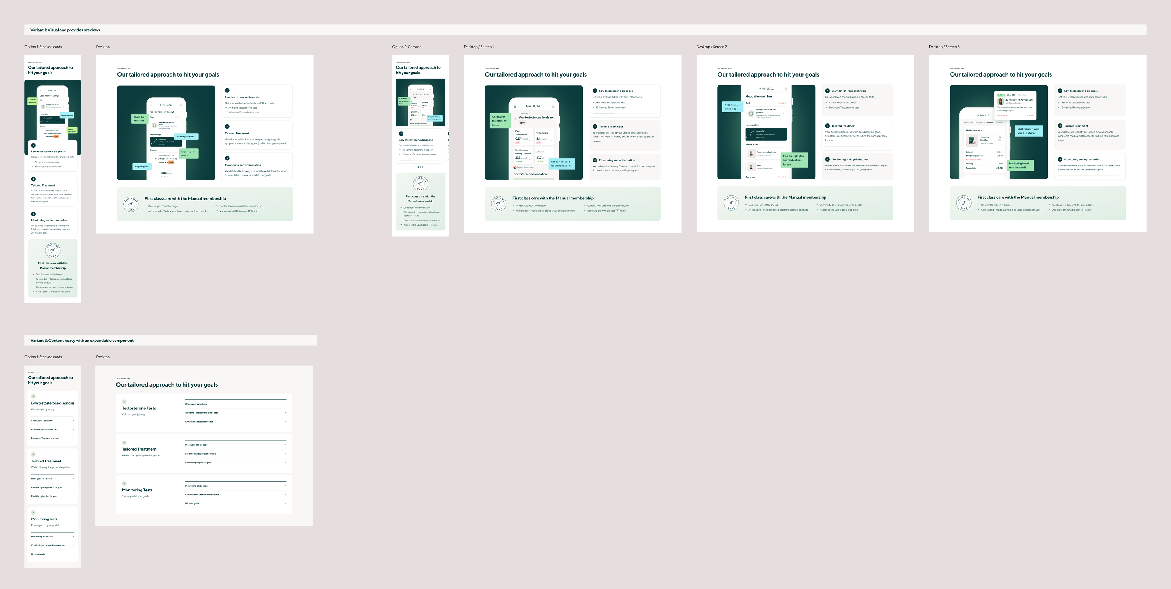
Final UI Designs for the 2 variants, Mobile and Desktop
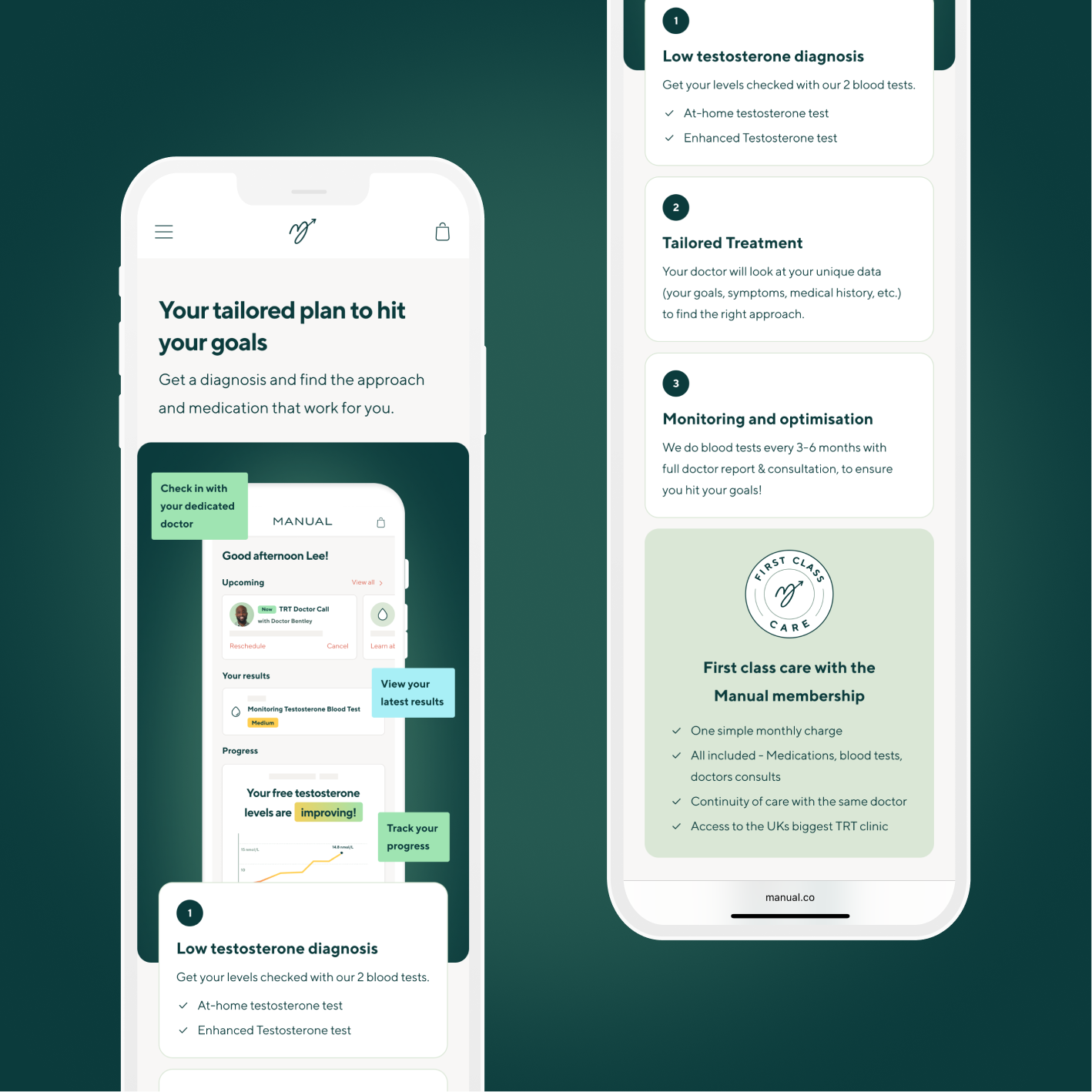
Close-up on the mobile final designs
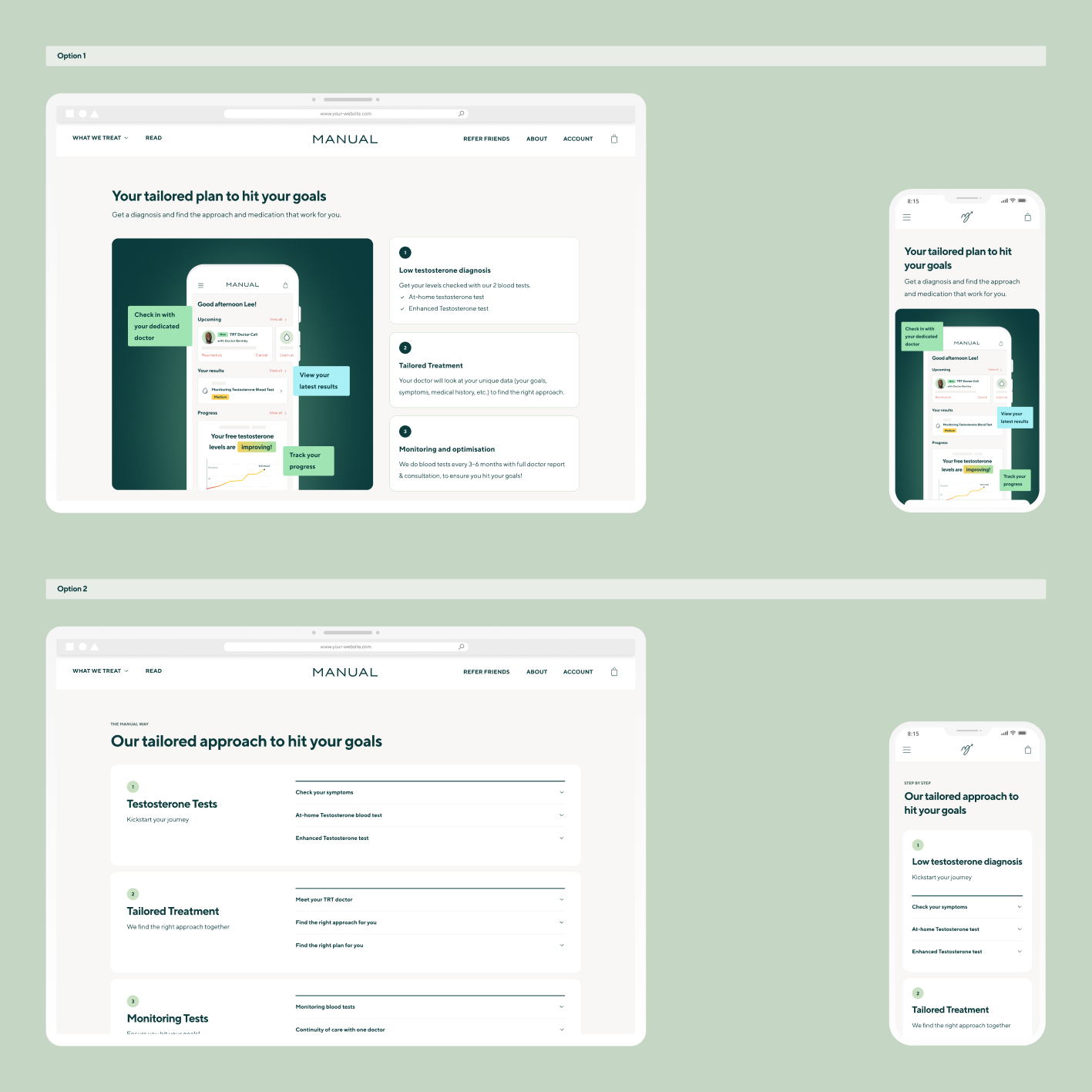
Close-up on the designs for the 2 variants
As part of this project I contributed to the design system and added to the expandable blocks.
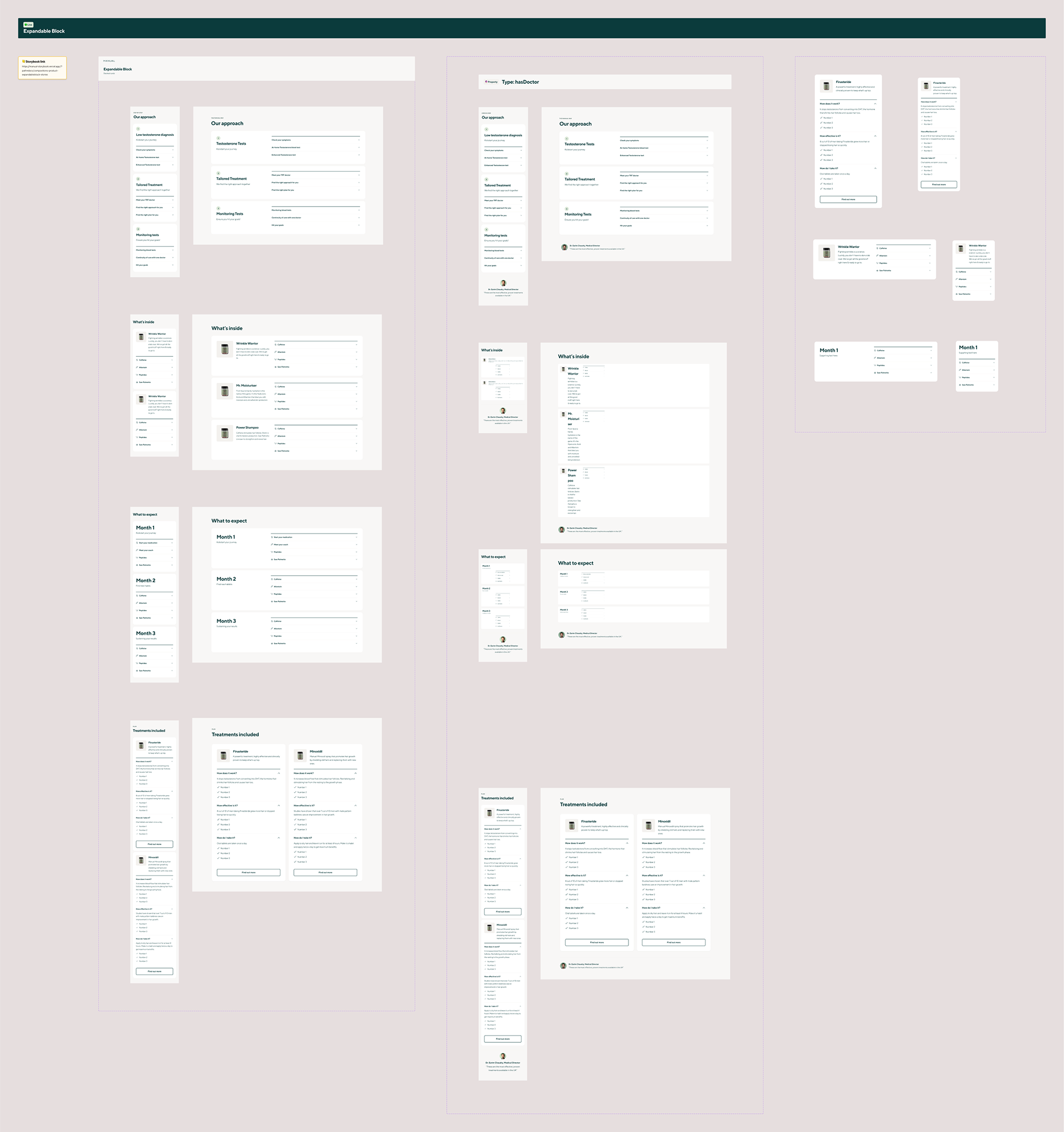
Addition of the "Expandable blocks" component to the Design System
Impact
From the Growth manager who led the project:
" These tests had huge business impact.
By removing the section about the process to starting treatment and replacing with a value-led approach, we thought that users would be more excited to get started. We were correct."
By removing the section about the process to starting treatment and replacing with a value-led approach, we thought that users would be more excited to get started. We were correct."
We observed 2 positive impacts:
Conversion rate
______
______
+ 20%!!!
(as shows the graph below)
Return rate
______
______
Higher
For BT1 and BT2 (Too early to back up with numbers)
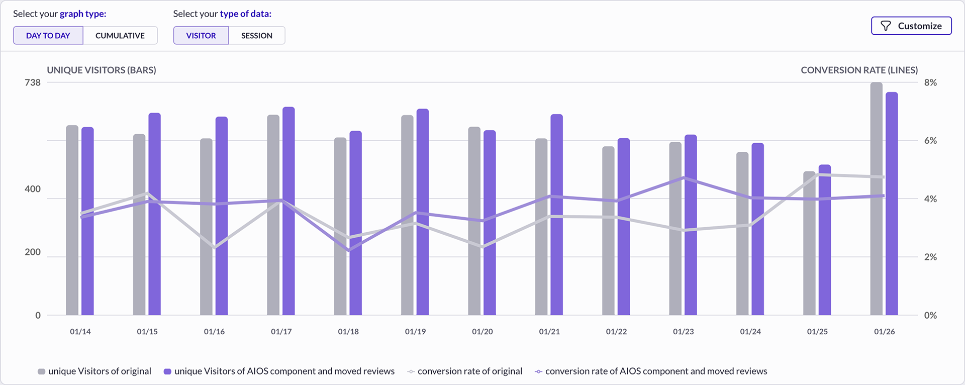
Data showing the conversion rate increase
WHAT NEXT?
The test was positive and taught us low intent users were craving more educational content to learn how exactly TRT works at MANUAL. It probably also helped to replace old text heavy content with a more concise and visual component.
In this instance we decided to move on and focus on higher intent users, as we thought there was an opportunity there, but we could have explored further.